Table of Contents
It’s easy to overlook the importance of a strong welcome email. After all, you’ve already gotten the customer to sign up, so they can just jump in and start using your product right?
Not necessarily.
Your welcome email is your chance to steer your new user in the right direction. It’s your opportunity to give them the information they need to get the most out of your product.
If you blow it, you’re essentially leaving it up to the user to figure everything out themselves. The end result of that is higher churn, dissatisfied customers and more resources put towards customer support.
Let’s make sure that doesn’t happen to you. Here are seven tips to write onboarding welcome emails that drive users back to your product. And we also threw in some real-life examples for inspiration!
1. Write a simple and captivating subject line
I mentioned it in our post about how to write effective dunning emails, but your subject line is super important.
It’s kind of like the curb appeal of a house (I’ve been watching a ton of HGTV lately). Have you ever driven down a road or community and all the houses look the same? They have the same colors, same yards and just look… generic.
But then, you notice the one house that has an attention grabbing color, beautiful landscaping with exotic plants and tons of character?
Well, your customer’s inbox is the street, and all those generic looking houses are the emails they get every day. Your welcome email needs to be the house with the amazing curb appeal if you want to stand out.
The good thing is welcome emails have a couple of advantages over other types of emails.
For one, according to multiple sources, welcome emails have a higher open rate than other promotional emails.
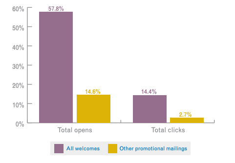
This is probably because unlike most marketing/promotional emails, people are actually expecting this one. One study showed that 74% of consumers expect to receive a welcome email as soon as they sign up.
That also means you should send your welcome email immediately if you want to increase the chances of getting it read.
Another benefit of welcome emails is they’re seen as a helpful guide and non-promotional. When someone signs up for your product/service, they usually look to your welcome email for what they should do next.
So there aren’t a ton of fancy tricks here. You just want to make it clear what your email is about and who it’s from. Let’s take a look at a few examples:
This first one is from a WordPress plug-in called Link Whisper. The subject line is simple and includes a clear call-to-action directly in the subject line. When I see it, I know that I need to open it if I want to activate my purchase.

Here’s another example from Frase. They personalize the subject line with my name, and add a little flavor with an emoji.

Last, here’s one from Enhancv. Their tool lets you design resumes and cover letters. So their subject line is super enticing for a new user.

If you notice, all three of these examples have something in common. They give you a reason to click, and they all specify that they’re “get started” emails.
Here are a few templates you can play around with if you’re struggling to come up with ideas for your welcome email subject lines:
- Welcome to [Product]! Let’s Get You Setup [First Name]
- Hi [First Name]: Here’s How to Get Started With [Product]
- [First Name]: Ready to Get Started With [Product]?
- Thanks for Signing Up! Activate Your [Product] Account
I think you get the idea. Just be clear with who the email is from, and give them a reason to click (which is usually to get started with their account).
2. Have a clear call to action
I’ve received welcome emails that give me a whole list of tasks to do. It immediately makes me think it’s going to take up a bunch of time so I put it off.
That’s the exact opposite of what your welcome email should do.
Instead of giving new users a laundry list of things to do, give them one, maybe two action items per email. Your goal is to get them to login and start using your product so they don’t just sign up and forget about you.
Take a look at this example from our very own product.
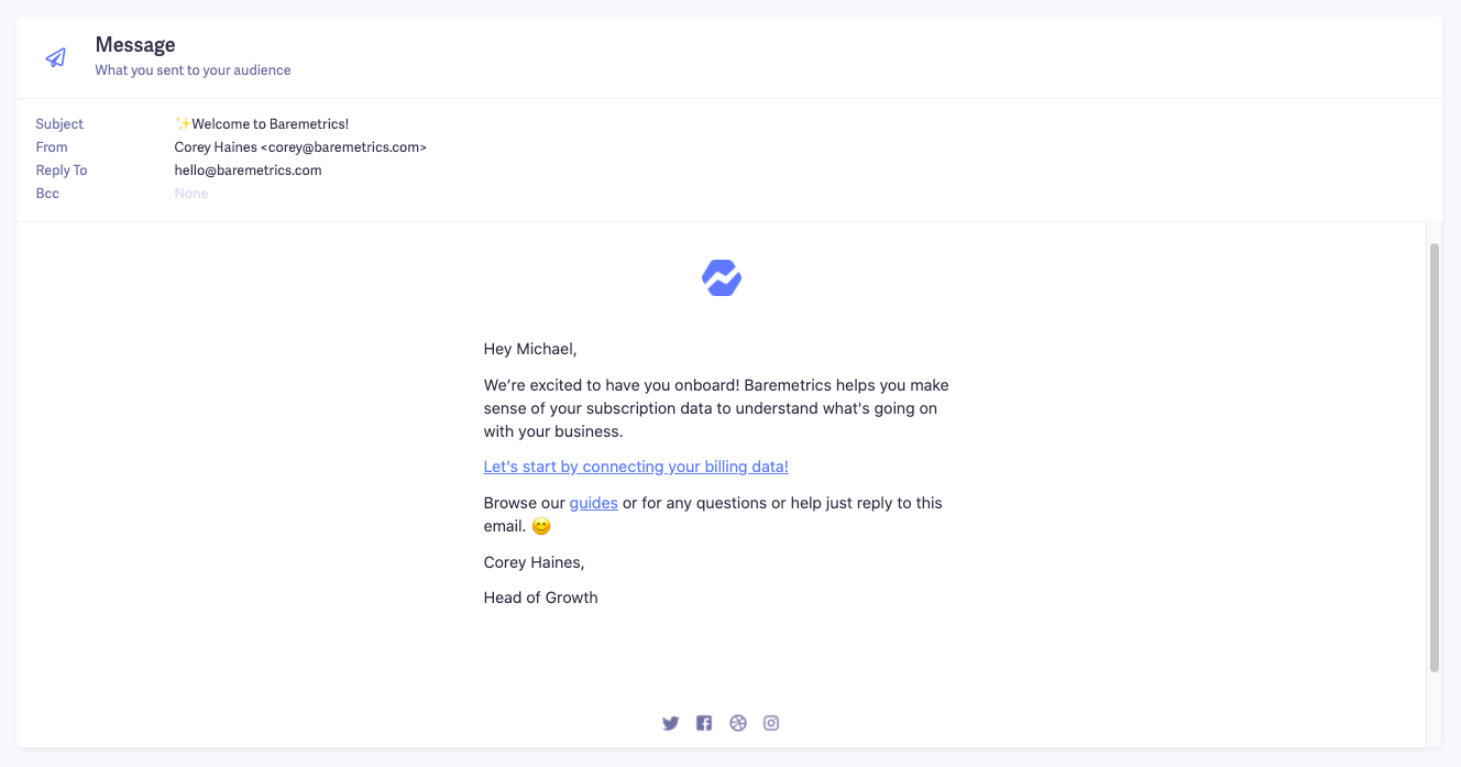
The main call to action is clear—connect your billing data. This is the first step a user needs in order to start using Baremetrics, so it’s the focus of our welcome email.
But you’ll also notice that there’s a second link in the email. That link doesn’t just go to the homepage of our support center. It goes directly to an article about how to connect your billing data to Baremetrics. It’s there to support the main call to action, not an additional task.
I’ll talk more about this in the next tip, but just think to yourself—what’s the most important action item a new user needs to do in order to get started with your product?
The answer to that will determine what the main call to action for your welcome email should be.
be honest
How well do you know your business?
Get deep insights into MRR, churn, LTV and more to grow your business
3. Don’t send too many onboarding welcome emails at once
Have you ever signed up for a SaaS product (or any other type of subscription) and been bombarded with multiple emails all at once?
Probably not the best experience, right?
It can feel overwhelming, and honestly, nobody wants to receive more emails than necessary.
The solution is easy. Think about all the necessary information a new user needs to know on their first day of signing up. Then, condense it into a single email.
This will force you to cut out all the unnecessary details you would’ve tried to put into two or three emails. When it comes to giving out information—particularly through email—the more concise you can be, the better.
Here’s an example of a series of welcome emails I received that could have easily been condensed to one or two emails at the absolute most. This is not shot at the company (they’re building a cool product), but it’s a good learning lesson.
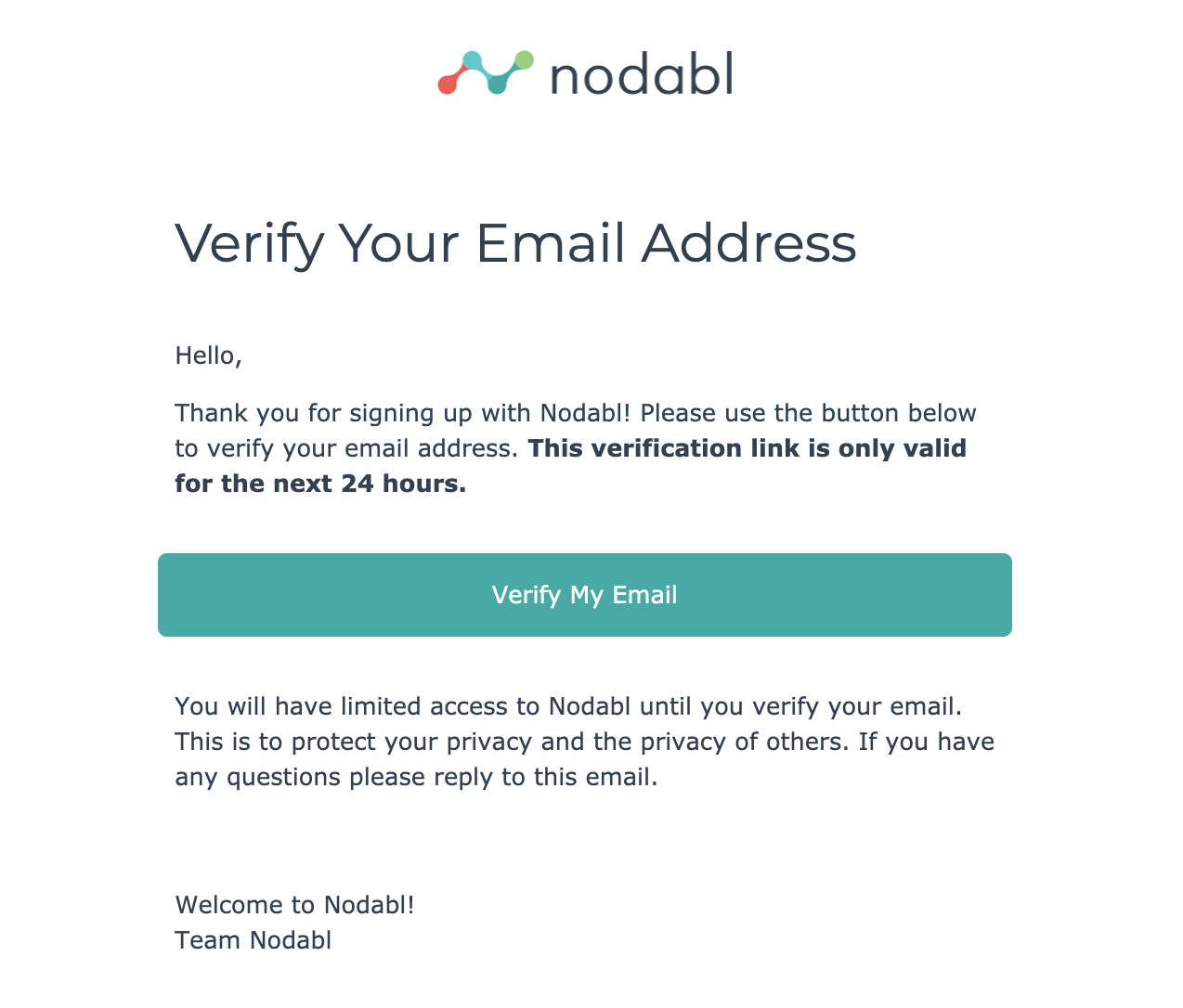
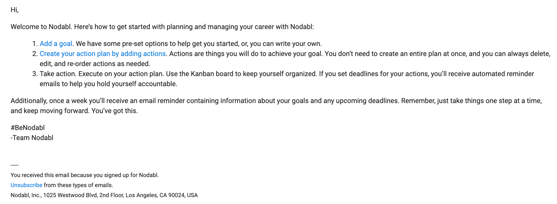
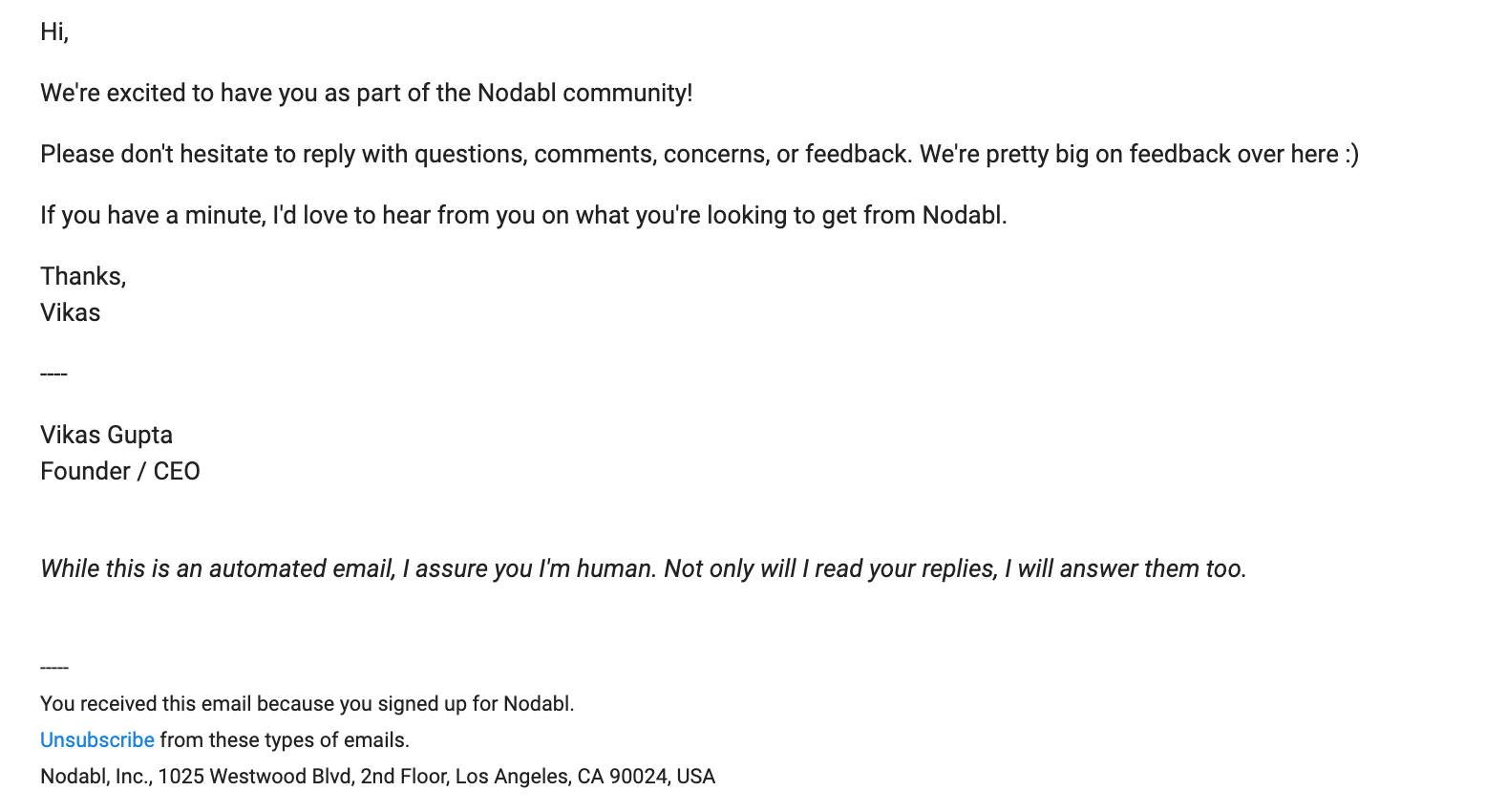
I signed for Nodabl earlier this year, and received three different emails on the first day.
Email #1
Email #2
Email #3
All these emails came within an hour. Let’s break down what we have here.
The first email is to verify your email address. Makes sense, because you want to ensure that people didn’t accidentally type in the wrong information when they signed up.
The second email is what I’d consider the official “welcome email”. They walk you through how to get set up.
The third email is meant to be a more personal welcome from the founder of the company. Since they’re a new company, they’re using it as an opportunity to gather feedback and learn about their users.
Those all sound fine, but who really wants to receive three emails from one company on the same day?
Here are two alternatives Nodabl could consider:
- Condense the emails into one or two
- Spread the emails out over the course of a few days
If they wanted to condense the emails, here’s what they could do.
First, skip the email confirmation message (just stay compliant with CAN-SPAM and GDPR requirements). Instead, they could verify the email address in their welcome email.
Then, to eliminate email #3, they could just send the official welcome email from the founder. And to get feedback/user information, they could work that into the onboarding process or include it in the welcome email.
Here’s an example of a single condensed version of their onboarding welcome emails.

For option B (spreading the emails out), they could just skip email #1, send email #2 upon signup, then send email #3 the following day.
And if you do want to send more than one “welcome” email message in the same day, space them out a bit!
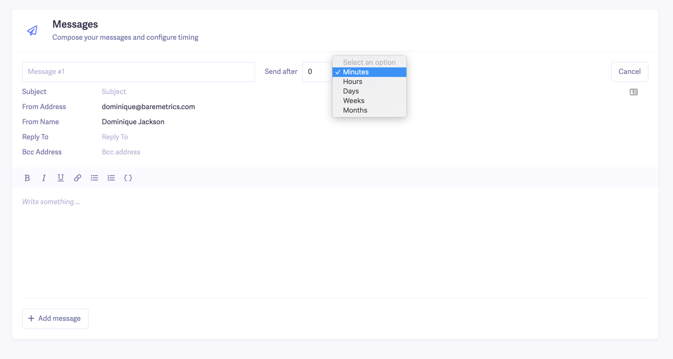
If you use our Messaging tool, you have the ability to space out your welcome emails minutes, hours or days apart (I’ll talk more about this a little further down). Wait at least an hour or so before sending off an extra email after your initial first one.
A good rule of thumb is to put yourself in your customers’ shoes. How many emails would you feel comfortable receiving from a single company after signing up for their product?
4. Use segmentation to personalize your welcome emails
If you really want to take your onboarding welcome emails to a new level, use segmentation to make them more targeted and personalized.
For instance, let’s say you offer a variety of products or plans/add-ons. What if instead of sending the same email to each user that signs up, you customized it based on the plan they signed up for?
I’ll use our Messaging tool to show you how to do it.
In the “Audience” section, we can define exactly who we want a message to go to. Since we’re targeting new users, we’ll choose customers that signed up less than a day ago.
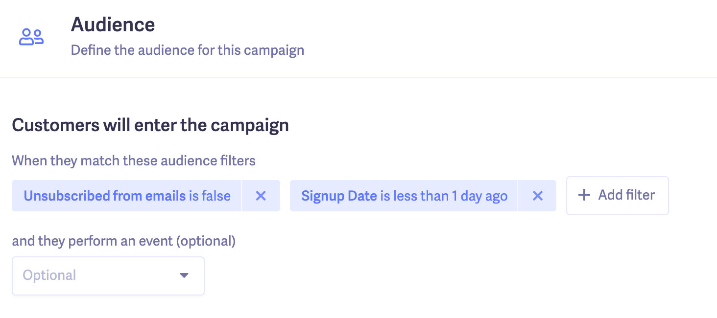
Then, let’s say we want to create a message specifically for new customers who’ve signed up for Cancellation Insights. We’d just add a Plan filter, and the completed audience would look like this.
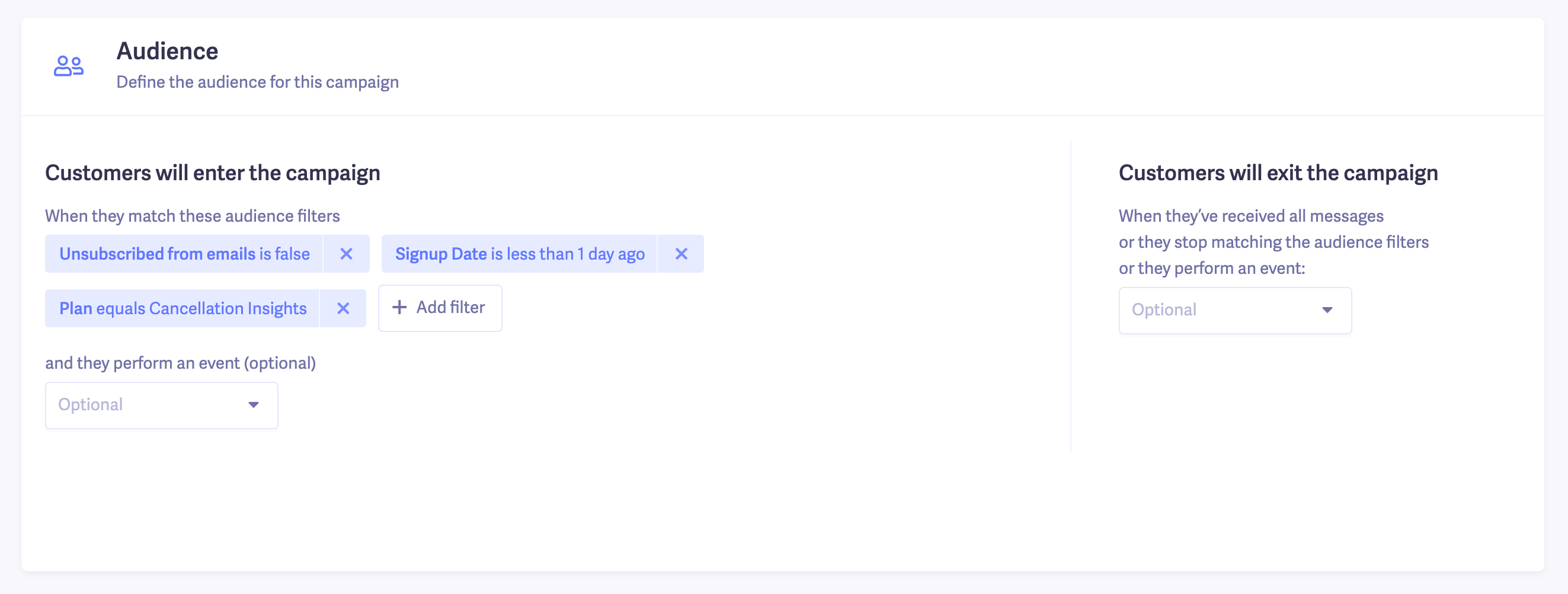
You can also segment your list based on other factors including freemium vs. paid plans, campaign source and product use case.
Freemium vs. paid plans
If you offer free and paid plans, the welcome email you send to free users might be slightly different from the one you’d want to send to people that are already paying you.
Campaign source
You can personalize your welcome email based on the source they signed up from. For instance, I signed up for StoryXpress through an Appsumo promotion and their welcome email was customized to reflect that.
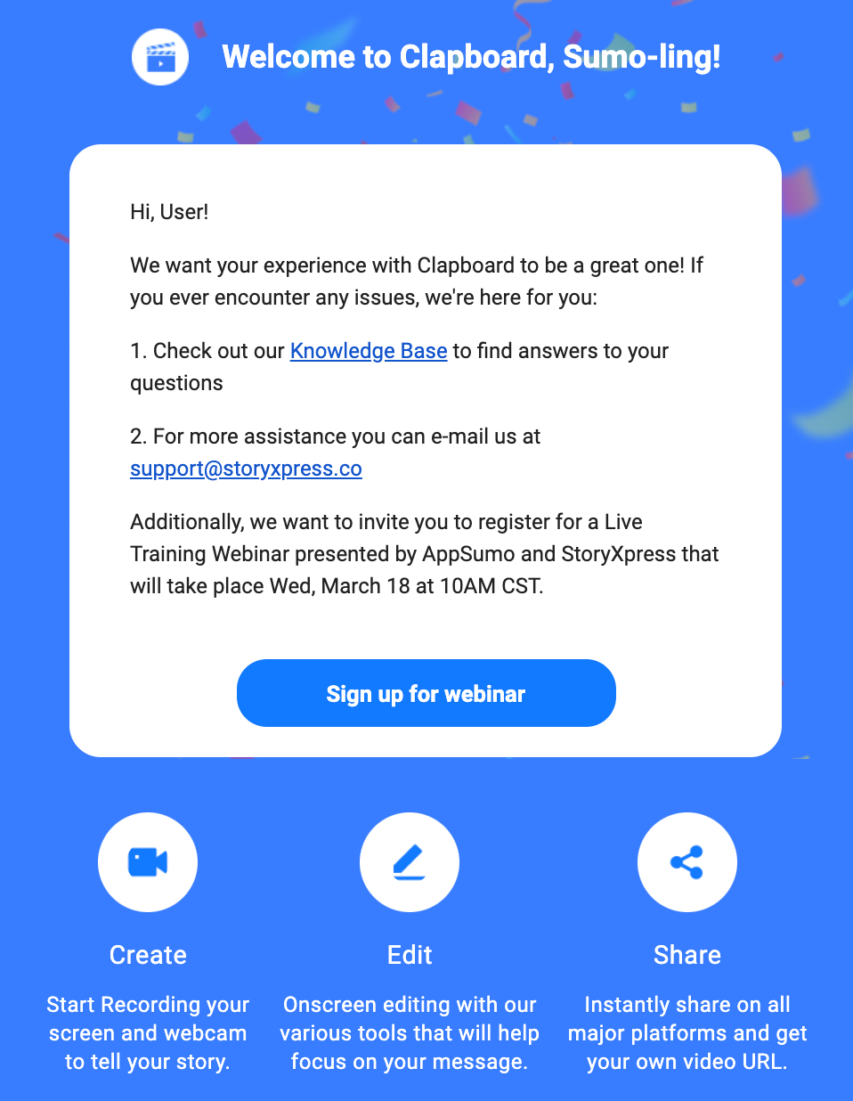
Their welcome email is great, but can you spot one mistake they made?
You can create something similar with our Messaging by segmenting audiences based on UTM codes. Just setup UTM tracking for the source customers sign up from, then segment your welcome emails based on that.

Product use case
As a content marketer, I use a bunch of tools that are marketed towards both agencies and individuals. For instance, ContentKing is a tool for SEO audits. They can be used by agencies, individual webmasters or people that work within companies.
If they were to find out which group users fit into (through their sign-up process) they could save that data with their CRM, then use it to customize their welcome emails.
That way, their welcome email to agencies could be about setting up their clients, whereas the email for individuals would be about how to set up their own website. It’s a small differentiation, but it can make a big difference when onboarding new users.
I think you get the point by now. But basically, there are a ton of ways you can segment your audience (location, industry, business type, etc.). Customize your welcome emails to make their onboarding process feel more personalized.
5. Offer a demo or product walkthrough
If you don’t require a product demo before a user signs up, your welcome email is a good time to offer one. A demo is one of the best ways to demonstrate how users can get the most out of your product, and answer any questions they might have.
Never make the assumption that users did super thorough research before signing up. They might not have watched your product videos, read through all your marketing pages or attended any of your past webinars.
They could’ve just stumbled across your site or heard good things about your product and decided to give it a shot.
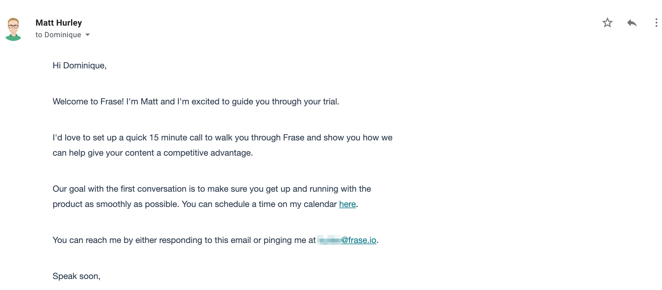
Use your welcome email to show them what your product can do. Here’s another example from Frase.
When I signed up, I got an email offering a 15-minute call to be walked through the product. They made it clear what the call would be about, and made it easy to schedule.
If you’re strapped for time, you don’t even need to do 1:1 demos. Setup webinars or send pre-recorded demos to them.
Here’s an example from Sprout Social.
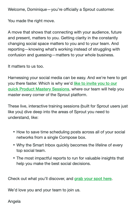
When you sign up, they send you an email that lets you opt-in to their Product Mastery Sessions so you can learn how to be successful with their product.
You can also go the route of Pigeon and record a demo of your product and send that in your welcome email.
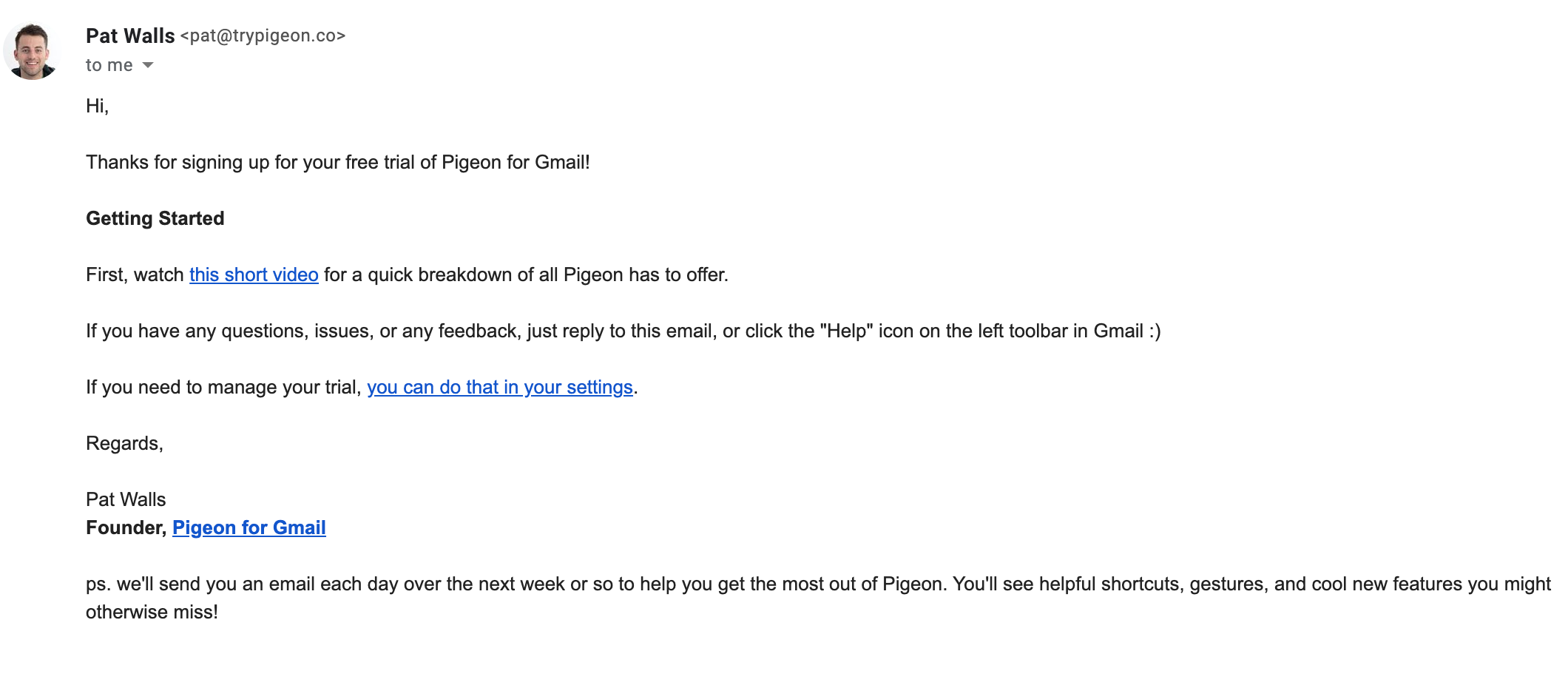
If you want to get really wild, you can combine this tip with the previous one about segmentation:
- Decide on broad buckets you can segment customers by (plan type, use-case, etc.)
- Collect that info in your signup process
- Pre-record demos for each of those segments
- Send customized welcome emails for each segment, with a link to pre-recorded demo
It’s a great way to demonstrate the value of your product at scale, while still having a level of personalization!
6. Don’t pressure trial users to pay (with one exception)
This tip is open for debate, but I typically wouldn’t recommend using your welcome email to hard-sell trial users.
They haven’t even gone through your trial yet to decide whether or not it’s a good fit, and you already want them to pay you? That kind of defeats the entire purpose of offering the trial. And it opens the door to high churn.
There’s one exception to this though. Offer a limited time deal if they pay now instead of later.
According to data from Invesp, welcome emails containing a special offer can increase revenue by 30% per email compared to welcome emails without an offer.
Here’s an example from Shift.
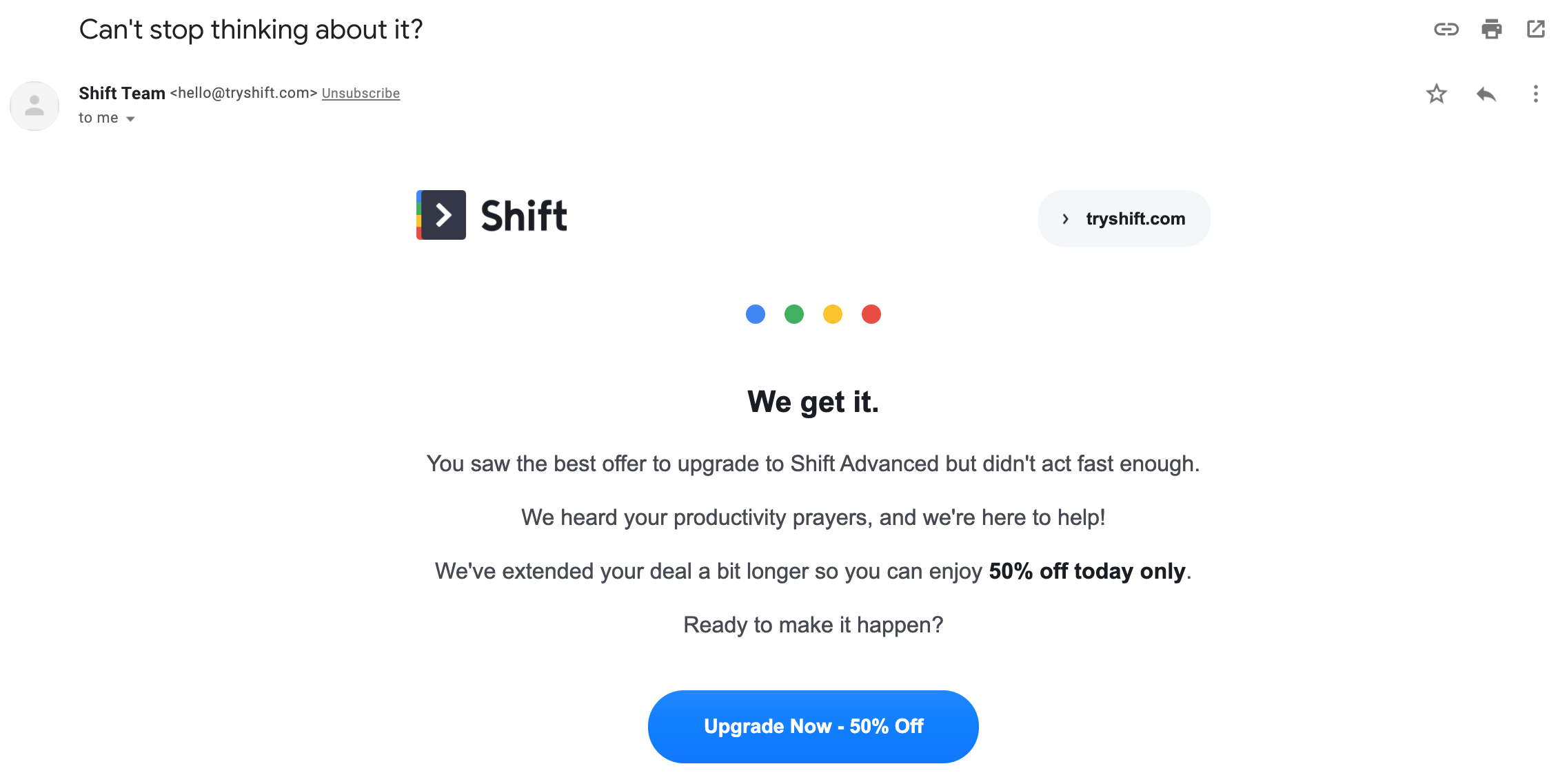
Second, offering early discounts can cheat yourself out of potential revenue. If the users would’ve paid full price for the product after going through the trial period, and you offer them 50% off upfront, you’ve cut your potential MRR from the customer in half unnecessarily.
The flip side is there’s no way of knowing whether or not the user will convert beforehand. So it’s a gamble either way.
If you’re going to give this a try, my suggestion would be to offer them additional value instead of a discount. For example, you could offer to set up their account for free or migrate their data at no additional cost if they upgrade from a free to paid account right now.
Remember what I said about not overwhelming your users with a barrage of emails all on the same day?
The fix for that is to send your emails in a series, rather than just a one-off.
It’s really difficult to give users everything they need to know in order to get setup in a single email. But sending five different emails one after another is overkill. Instead, create a welcome email series over the course of a few days.
Here’s an example from Oberlo.
They start off with a very good welcome email. It’s pretty long so here’s just a snippet.
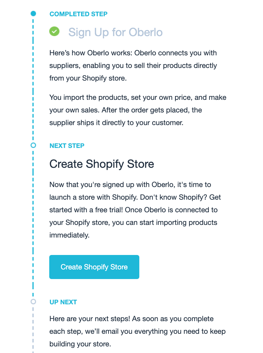
After that initial email, they send several follow-ups to help welcome you to their product and ensure you’re getting setup properly.

And as you can see from the dates, they space them out a day or two.
But what exactly should you put in these emails?
The easiest thing to do would be to map out the steps it’d take for a user to get setup on with your product. I’d suggest condensing it down into 3-5 steps at the most, that way it doesn’t drag on.
In each email, map out an action item you want the user to accomplish for it. I’m going to go back to the Sprout Social example for how to do this.
After their initial welcome email, they send a few more that each covers a main part of the software.
Here’s one where they talk about their content scheduling:
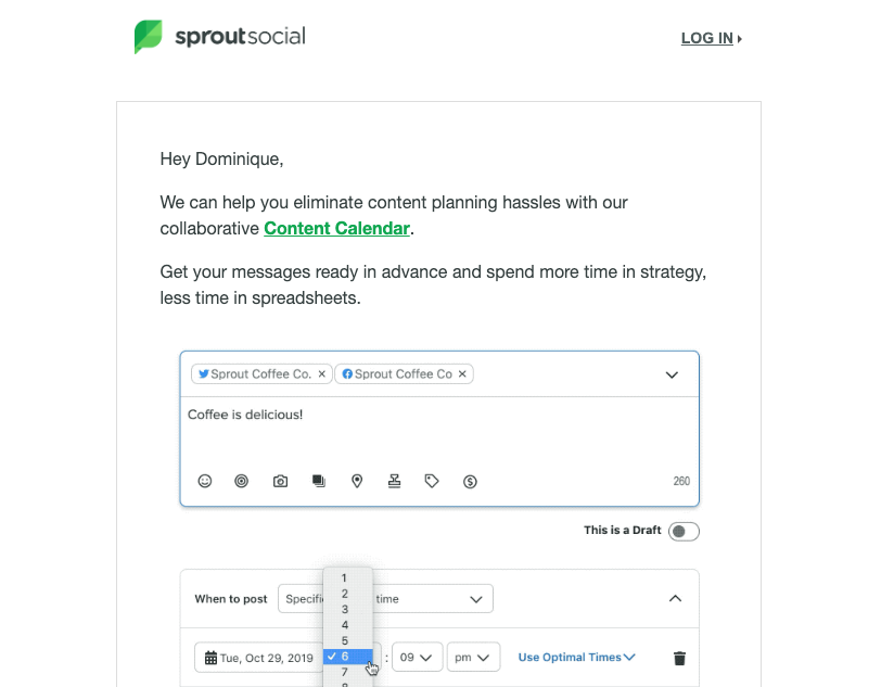
Then, they send another one about how to measure your post’s performance (the assumption being that you’ve started scheduling content).
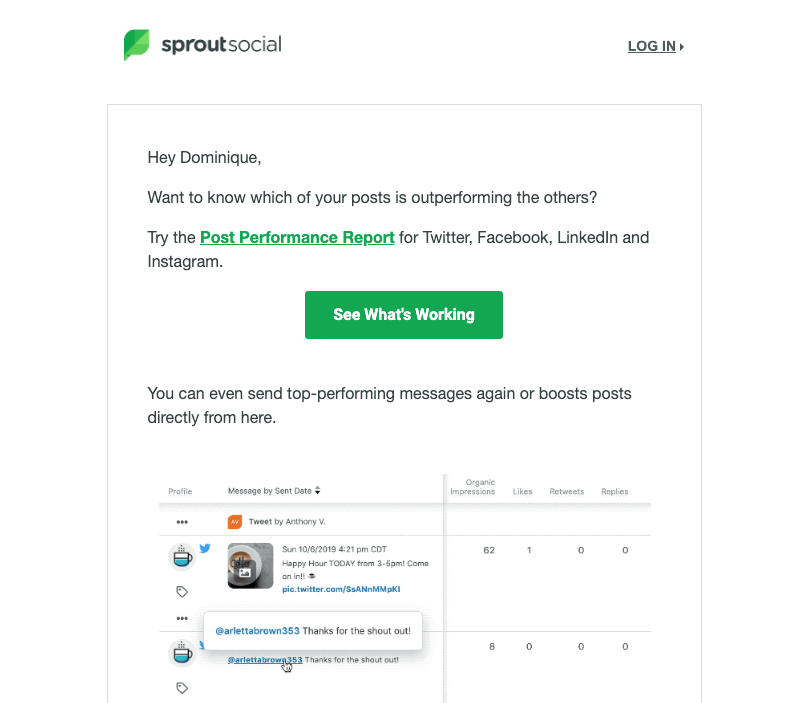
By sending the emails out in sequence according to how people would logically use your product, it makes it easy to follow and gives users more direction.
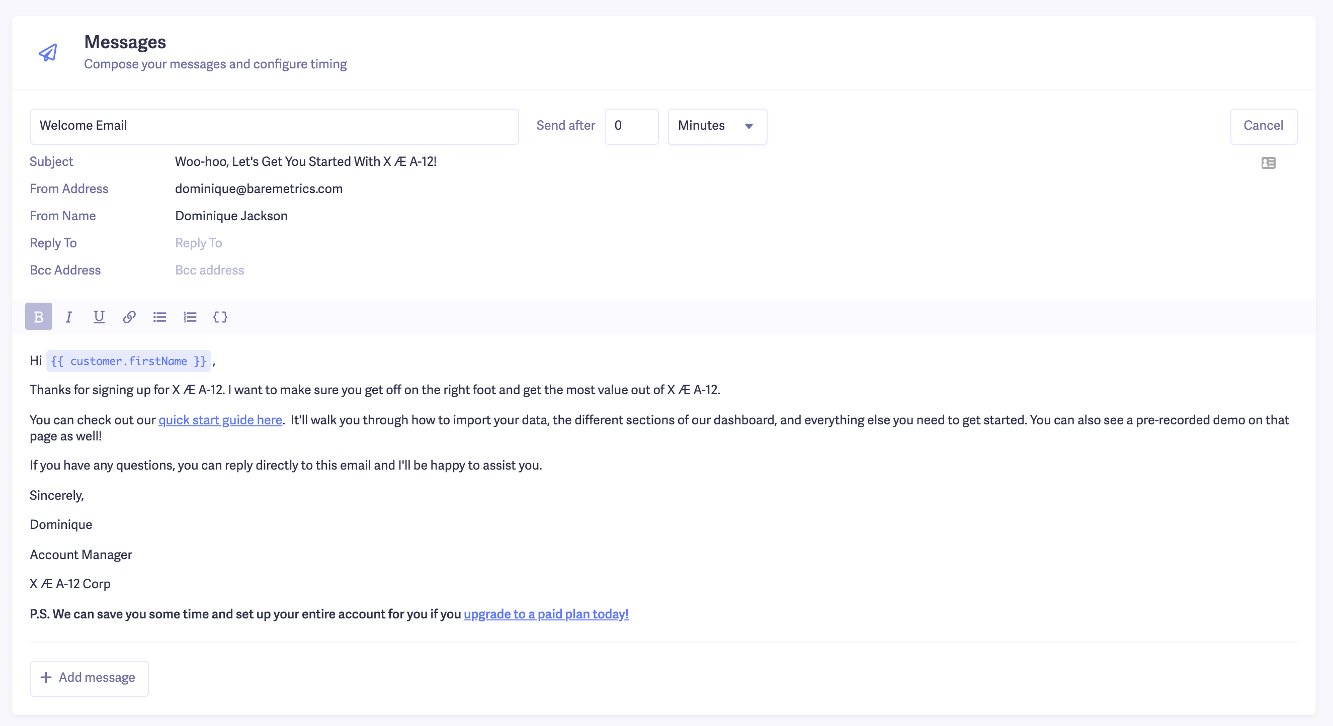
You can easily set up a series like this in our Messenger tool. Let’s say we run a web analytics tool. A 3-part welcome email series could look something like this.
The first email, I’ll introduce myself and give the user an action item to complete in order to get started. This email will be sent right when they sign up.
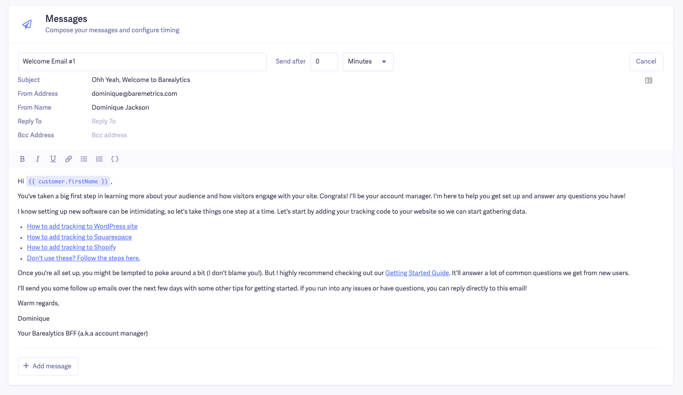
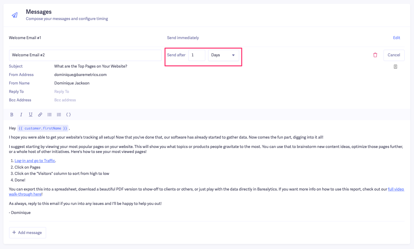
Then we’ll click “Add message” to create a follow-up email to send a day after they sign up. In this one, we’re going to show them how to do one of the most popular tasks in our software.
Notice that I changed the “Send after” date to 1 day. That means it’ll go out the day after the user signs up and enters this email flow.
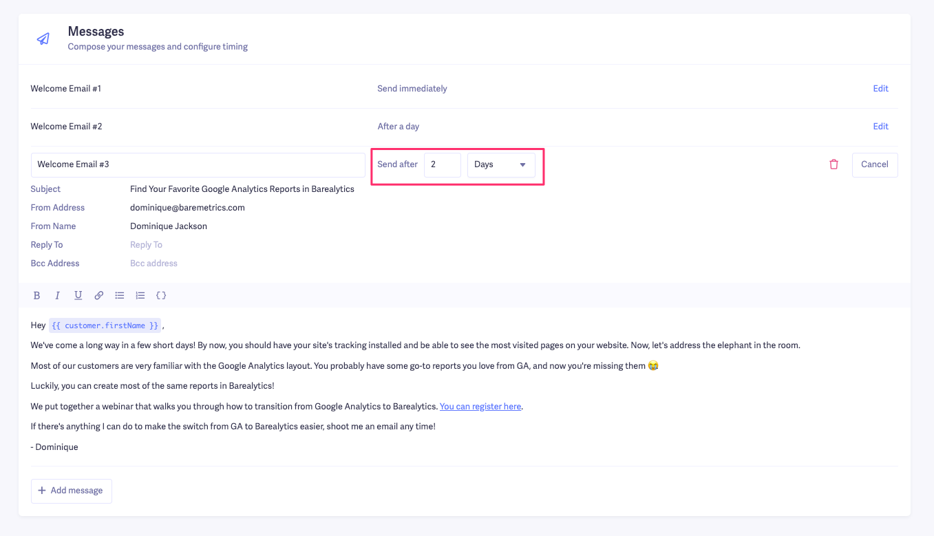
Let’s round this series out with a third and final email that invites the user to a free webinar. I’ll change the “Send after” date to be two days after they sign up.
And just like that, you have a quick and effective series of welcome emails to send to new users.
After the welcome series is done, you can continue to send them tips and tricks for your product, or a weekly newsletter to keep them engaged with your brand.
7. Measure your email performance and make changes
Once you start sending out all these emails, you probably want to know whether or not they’re working.
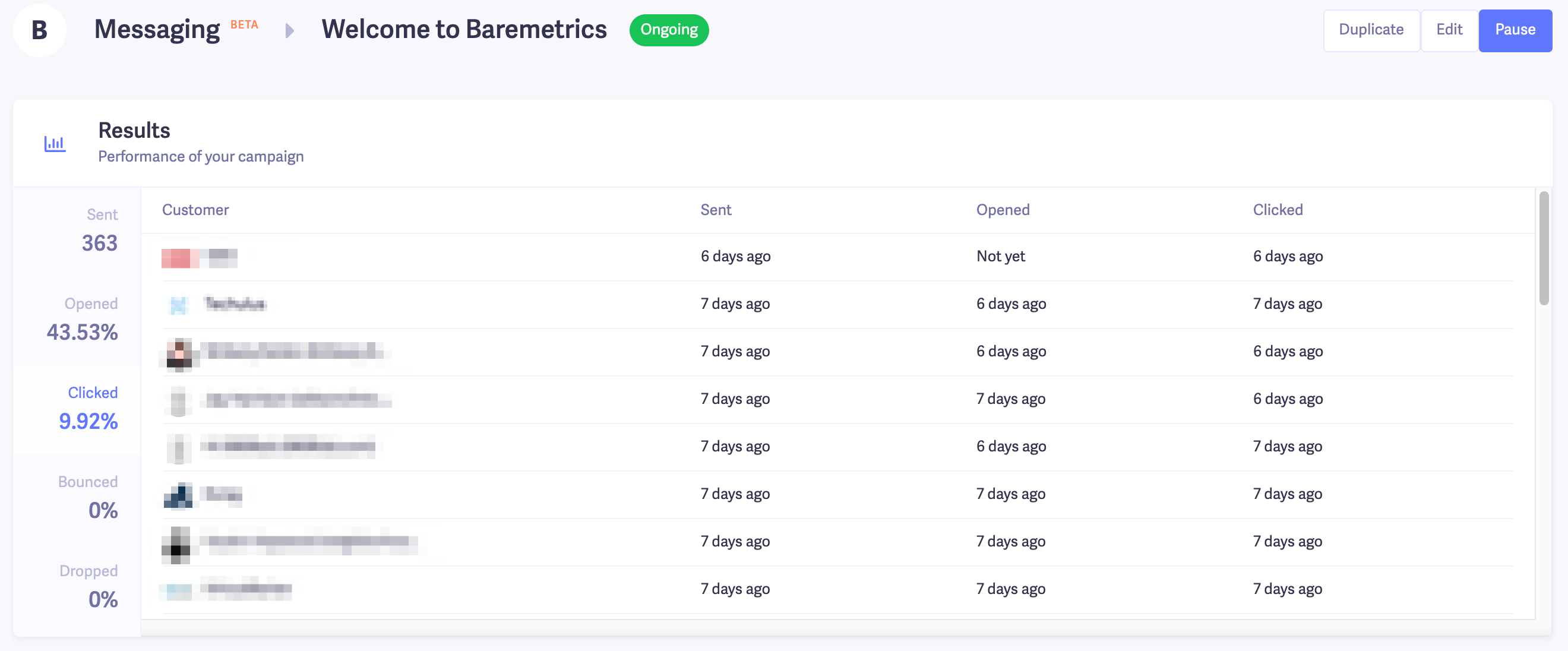
There are a couple of levels to analyze your onboarding welcome email’s performance. First are the two most common email stats businesses tend to look at:
- Open rate: How many people are opening your emails
- Click rate: How many people are clicking through from your email
You can see this in our Messenger tool (and check the stats for each email in a series).
If you want to go a step further, you’ll measure things like in-app engagement from people that’ve viewed these emails. That goes a little beyond the scope of this article, but essentially, you’d do this:
- Setup tracking for the links in your email using UTM codes
- Track the performance and app-engagement of visitors from those UTM codes
Here’s an article that walks you through the process in-depth.
There are a couple of things to keep in mind here though. If people who ultimately click through from your email and go to your software perform poorly (they bounce, don’t stay very long, or even churn), that’s not necessarily the fault of your welcome email.
There are a ton of other factors to consider like your product’s design and overall UX. Generally, if people are opening your email, reading and clicking through, the email has technically done a bulk of its job.
But if people aren’t opening or clicking your emails, that’s usually when you should consider making tweaks to your subject line and copy. Keep testing and see what works best.
Are your welcome emails…welcoming?
Onboarding is a critical part of running a SaaS or subscription business. If users don’t understand how to use your product they’re not going to keep paying you.
Start the relationship with new users off on the right foot by putting together a strong onboarding welcome email that engages and converts.
Baremetrics Messaging allows you to message the right customers at the right time with billing and subscription data at your fingertips. Try a 14-day free trial today.
![]() Send and track your welcome emails
Send and track your welcome emails
Baremetrics Messaging allows you to message the right customers at the right time with billing and subscription data at your fingertips.

