Table of Contents

Everyone should be interested in using their data to optimize their SaaS pricing. After all, finding the right pricing is one of the best opportunities for revenue growth in our industry.
But what if I said you need to start our data collection over again from scratch, years after launch? What if I told you to stop working with your old data and commit to six months of carefully controlled data collection in the interest of price optimization?
Many would balk at the notion. If you have a dashboard and data, why can’t you use that information for price optimization experiments?
The short answer is that if we use old data for price optimization, any insights we find are probably noise.
To get a reliable signal for our price optimization, we need to collect data in a structured way. If we plan our data collection carefully, our experiment avoids wasting resources on inconclusive results.
This article (part three of our Price Optimization series) will explain in detail why experiments are key for finding the best price, and what data you to run experiments correctly.
Price Optimization in SaaS: Why You Shouldn’t Use Old Data
Pricing a SaaS product is hard, especially when your company is first starting out.
The good news is that after some initial sales, you can start collecting data to run experiments and collect actionable data.
Let’s look at an example. Below is an MRR plot from a real Baremetrics customer in its first two years:
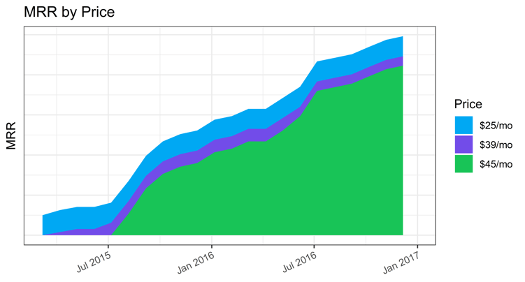
We can use this data to gather insights on a relationship between our price and sign-up rates. Spoiler alert: something is going to go wrong!
This business owner launches at a low price, $25/month, then raises the price twice: first to $39/month, then finally to $45/month.
Maybe the strategy this business owner followed was to increase the price until something bad happens.
Whatever the strategy, for it to help optimize our revenue, we need a KPI by which to judge which price is better. For our purposes, to find the best price we will look at what happened to sign-up rates when we raised the price.
Baremetrics offers powerful reporting tools that make it easy to track important metrics and KPIs. Get your free trial here.
Comparing Sign-Up Rates
How do we compare the sign-up rates between these price points? We can assume if we raise the price, there will be fewer signups, but by how much?
Let’s try plugging the data into a simple statistical model to estimate monthly signup rates. For the curious, this is a Poisson model which we will discuss more in future posts.
This model uses data in the form of sign-up counts per month. For now, all we need to know is that data points get put into the model, and an estimate for sign-up rates comes out.
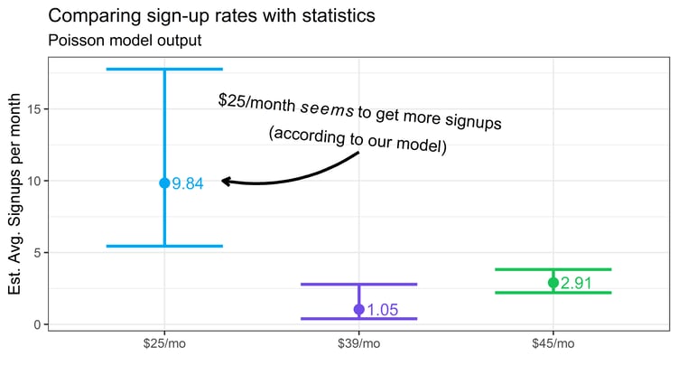
The above shows estimates for the sign-up rates at each price point. The error bars show uncertainty about the estimate (95% confidence intervals).
What does it tell us?
- The model is confident that the signups at $25/month (blue) are higher than the others.”
- What’s more, there is overlap between the purple and green, which is the model’s way of telling us it isn’t sure that the sign-ups are actually different between those prices.
Which Price Gives the Most Revenue?
Now that we’ve compared sign-up rates, we can explore what this implies for revenue.
To get revenue estimates, we multiply the sign-up rates by the expected lifetime of a customer. In this dataset, that’s 49.8 months (to see more of how we got this number, check out our previous article about customer retention!)
Then we multiply this by the price:
Expected Revenue = Signup Rate Expected Lifetime Price
This equation gives us an estimate for the total revenue we expect to earn for each month for each price point.
Now, let’s transform the Poisson regression results using the formula. This allows us to compare these groups by their total revenue, as shown in the below chart:
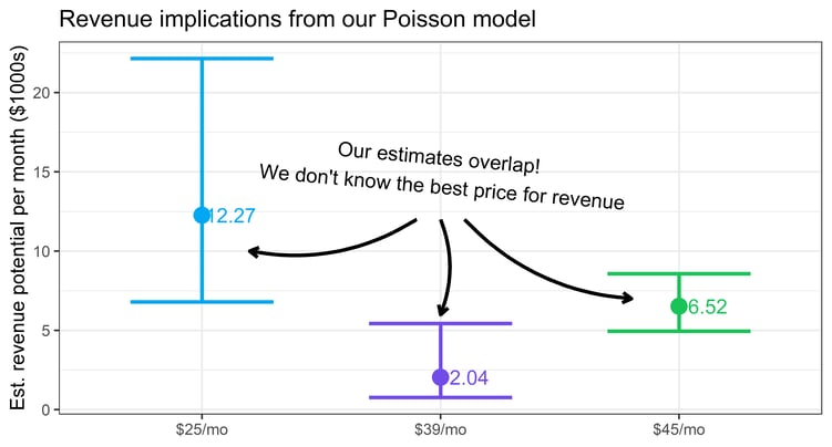
Note that now, even the lowest price group (in blue) overlaps with the highest price!
Overlapping error bars mean our model doesn’t know which price gives the most revenue, they may even be the same!
Simply put, we spent two years collecting data on our prices, and we still don’t know which one is better for revenue.
What went wrong here?
For one, we couldn’t distinguish our prices because we didn’t collect enough data. The error bars are so large, they overlap. With more data, we would get tighter error bars, which would allow us to distinguish the prices.
Take, for example, the error bar for $25/month (blue). It’s much bigger than the others. If we had more data on $25/month, the error bar would be smaller, and we could tell with greater certainty whether it’s different or not.
Let’s look at how many days we gave to each price:
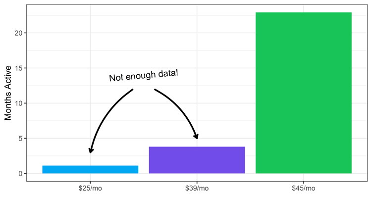
Notice how the launch price (blue) was online for only a fraction of the others’ time. We have a highly unequal, possibly random distribution of days given to each price.
If we planned the comparison before collecting the data, we would give each price an equal number of active days. Better yet, we could select only two prices instead of three, so that each price would receive even more data for a higher resolution comparison.
You may ask, how many days should we give to each price? It turns out we can use statistical techniques related to Power Analysis to estimate how much data we need to collect to answer our question reliably.
This way, we can assess whether we have the resources to carry out a successful experiment—more on that in a future post.
In any case, the result of analyzing this old data is disappointing—two years of data collection, and nothing to show for it.
We may grasp for a way to salvage it. In the absence of any good signal on revenue, we notice that the $25/month plan appears to have higher revenue because the average amount is higher than the others, and most of the space covered by the error bars is above the other options.
Maybe we could plan on using the $25 a month plan while we plan our next experiment. But even then, assuming the results were better, would we be justified in our choice? The answer turns out to be no, and here’s why.
The Best Way to See Your Data
Use Baremetrics to measure MRR, LTV and other critical business metrics that power your analytics. Want to try it for yourself?
Additional Factors to Be Aware Of
Lack of data wasn’t our only problem. To see what else is wrong, let’s look at the data from a different perspective. Here’s the data as a time series:
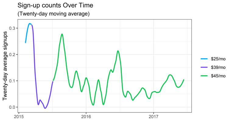
The chart above shows sign-ups as a time series. The line indicates a 20-day moving average to reveal the trend. Each color shows where each price was active.
Notice how much variability the sign-ups have, even when the price stays constant. Sign-ups dip and soar in a way that doesn’t seem to have anything to do with the prices we chose. What is going on?
Do we see a trend between sign-ups and price? No. Why?
As it turns out, price is not the only factor changing our customers’ sign-up rates. There are all kinds of factors that could be changing sign-up rates that have nothing to do with price. But we didn’t collect data on any of them.
Sign-up rates could be affected by changing market conditions, different sales teams, or the arrival of a competitor, or something we never thought about.
Since we didn’t keep track of those, our results are distorted. We don’t know what changes we should attribute to price and which to something else.
The truth is that we can’t know all the possible factors that affect our dataset.
All we know is that our data on sign-ups were distorted by factors we didn’t know about. At this point we are stuck. We can’t get any insights into the causal relationship between price and our customers’ willingness to sign up. There is no way to fix this after the data is collected.
Conclusion
Experiments are time consuming and can feel like a hassle. But when done properly, they’re the best way to gain valuable insights under these circumstances. If we don’t do an experiment, we will end up mining noise from our data.
If you are intimidated by the challenges we faced here, don’t fret!
Our next articles will discuss the methods we use to work around these problems. We will discuss ideas about planning experiments that truly offer actionable insights.
Our posts in the series will include questions about:
- What prices should I choose to test?
- How much data do I need?
- How can I finish my experiment in a reasonable timeframe?
- What would an experiment look like in practice?
- What if I don’t have the resources to do an experiment?
Stay tuned for more, and send any questions you may have to david@baremetrics.com. Happy experimenting!
