Table of Contents
How’s your business doing today? How has your MRR been trending over the past six months? Is churn on the rise?
You can answer these questions in about 1 second with a SaaS dashboard.
When you’re trying to grow a SaaS business, having data that’s easily accessible should be a top priority. It’ll help you quickly answer questions from investors or your team. Plus it gives you the information you need to make informed decisions about the future of your business.
I’ve gone through the hassle of trying to build dashboards in spreadsheets or hacking something together with multiple tools. And I have to say, joining Baremetrics and having all our KPIs (key performance indicators) in one place saves me so much time and brain power.
Whether you currently don’t have a dashboard or are using a tool you’re not 100% satisfied with, this guide is for you.
I’m going to give you a step-by-step guide on how to create a custom SaaS dashboard, plus share some examples to inspire you. Let’s dive in.
- Why you need a SaaS dashboard
- The best tool to create a SaaS dashboard
- How to create a custom dashboard for your business
- SaaS dashboard examples
Why you need a SaaS dashboard
A SaaS dashboard is like a snapshot of the health of your business. You can think of it as your “medical chart” when you go to the doctor, but it is for your business.
Your dashboard tells you how your business is doing regarding MRR (monthly recurring revenue), churn, ARPU (average revenue per user) or any other metrics you track to measure growth.
Instead of getting numbers from a bunch of different tools or having to deal with complicated spreadsheets that only you understand, your SaaS dashboard serves as the “home” for the metrics that are most important to your business’ growth.
Beyond that, though, the main reasons I suggest using a SaaS dashboard are:
1. Build transparency with your team
I’ll be honest. I’ve never paid as much attention to the health of the companies I’ve worked for as I have since joining Baremetrics. I think a large part of it is that our data is super easy to access.
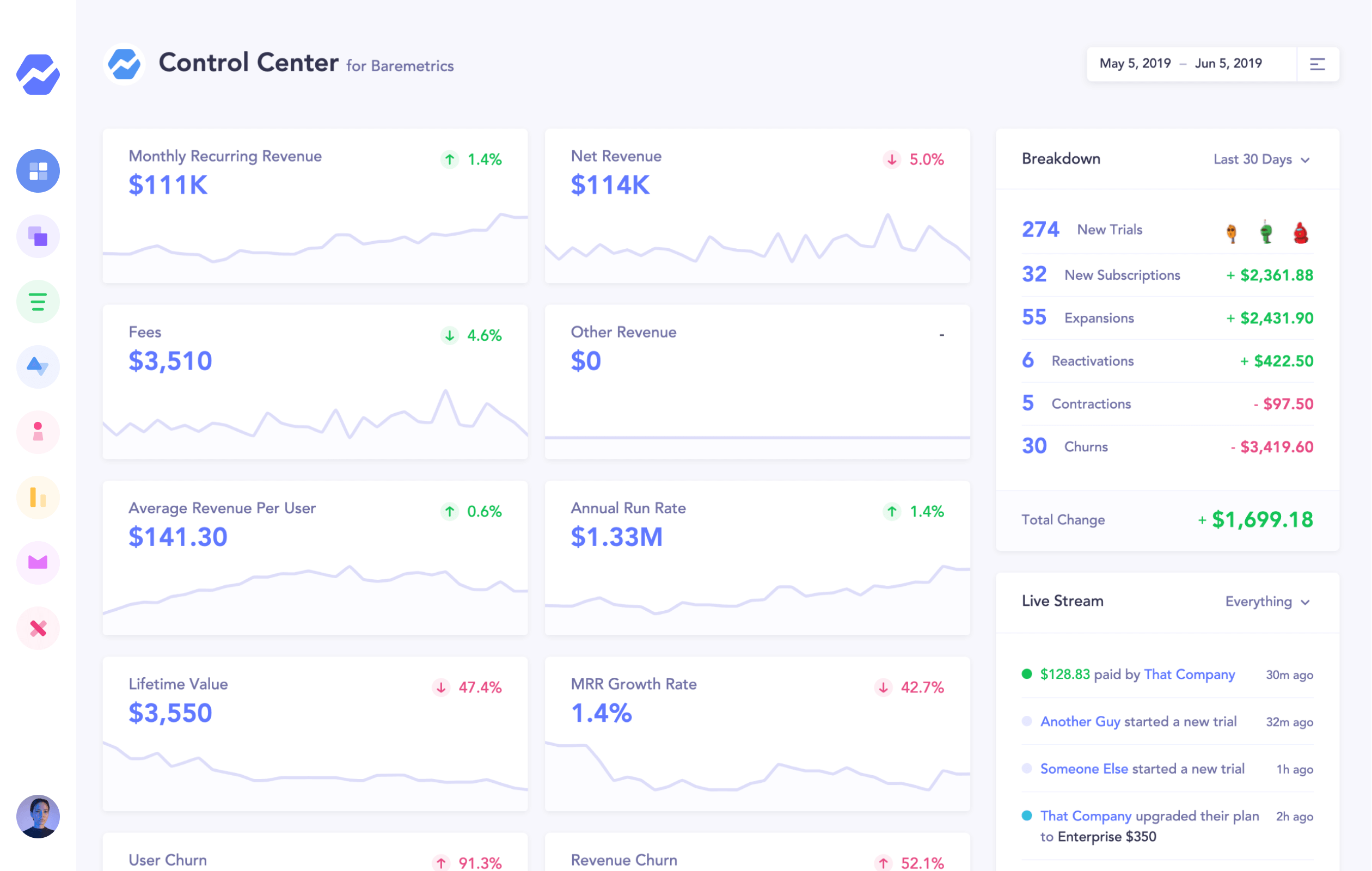
As we create more content and improve our marketing, I can log into our dashboard and see its impact on our MRR. It’s extremely motivating.
Unfortunately, a lot of SaaS companies fall into one of these buckets:
- Don’t share any metrics with their team at all
- Only share the top-level metrics like MRR and churn rate (and when they do, it’s on a quarterly or annual basis)
- Only share metrics when something went wrong or they’re celebrating a win
Using a SaaS analytics dashboard that your entire company can access allows everyone to look into the numbers and learn more about how the business is doing.
It also gives everyone context to the decisions you have to make as a founder. Telling your team that you have to cut expenses is a lot easier when you can show them your revenue has been declining for six months straight.
2. See where your business is today
If you work in SaaS (particularly for founders), you’re probably addicted to checking your metrics. Sure your MRR isn’t going to drastically change overnight, but you need to know your numbers.
For instance, I like to see how many customers we added or lost the previous day. If we see a huge spike or drop, I know something’s off, and we can dig into it.
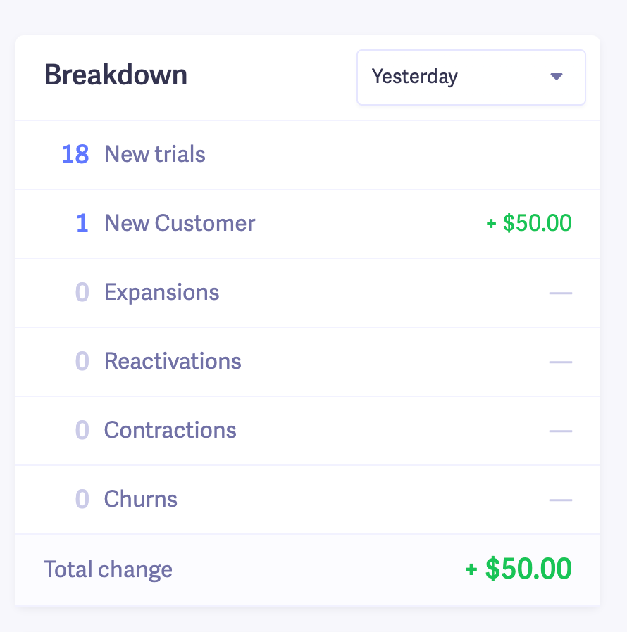
This is part of our Baremetrics dashboard. You can build yours here.
Another time this comes in handy is if you work in a team.
How often have a manager or someone from another team has asked you about a specific metric? Whether it’s MRR, customer churn, or anything else, people have questions.
Your SaaS dashboard is a quick way to get the answers without fumbling around and having to click through a bunch of windows. It’s great for answering questions from investors as well.
3. Spot issues ahead of time (no surprises)
Barring some wild event you didn’t see coming (like negative PR), you won’t see drastic changes to your metrics all in one day. Big changes generally happen over time.
For instance, your MRR isn’t going to go from $200K to $100K in a day. What typically happens is you slowly lose some MRR over the course of several months, and then one day you wake up and wonder where all your revenue went!
That’s an extreme example, but you get the point.
Your SaaS dashboard helps you avoid those surprises. When you see big changes in your dashboard, you should immediately dive into them so you can course correct before things get out of control.
For example, around February and March of this year, we noticed our MRR growth was slowing down and trending in a negative direction.
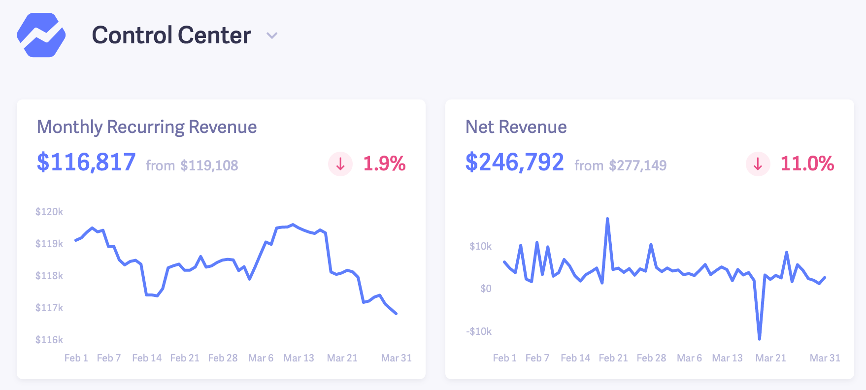
So we started implementing different growth tactics to get back on track, like focusing on upsells and even experimenting with a new product line. Over time, we were able to get things back on track and started trending in a positive direction.
If we didn’t have a dashboard that we tracked on a regular basis, it would’ve been more difficult to see that downwards trend early on, and we would’ve been slower to take action.
The faster you can spot negative trends or issues in your business, the less long term damage it’ll cause you.
4. Plan for the future
Knowing where you stand today is nice, but unless you’re able to take that data and turn it into a plan to improve your business in the future, what’s the point?
A strategic dashboard (meaning customized to your business) can be a great starting point for your growth plan.
Like I mentioned in #3, we used the data from our dashboard to prioritize our growth efforts. If you’re a smaller startup with limited resources like us, you need to know where to put your focus.
When we saw that our revenue was declining, we shifted our development resources towards our marketing and growth until things were in a better place.
The best SaaS dashboard – Baremetrics
Unless you plan to use spreadsheets, you’re going to want a tool that can build your SaaS dashboard for you.
Obviously, I’m going to recommend Baremetrics here. But not just because it’s our product. Our dashboards are easy to build, give you tons of customization options and they’re a lot easier on the eyes than Excel and Google spreadsheets (yay data visualization!)

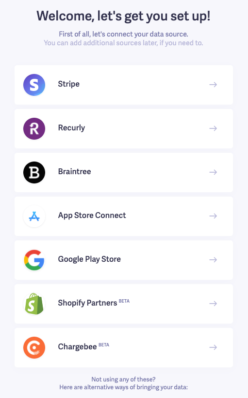
Baremetrics pulls in your SaaS metrics directly from your data source (like Stripe and Recurly). So all you need to do is connect your account and we’ll automatically put together your dashboard with all your data.
One of my favorite parts about our dashboard is the live stream.
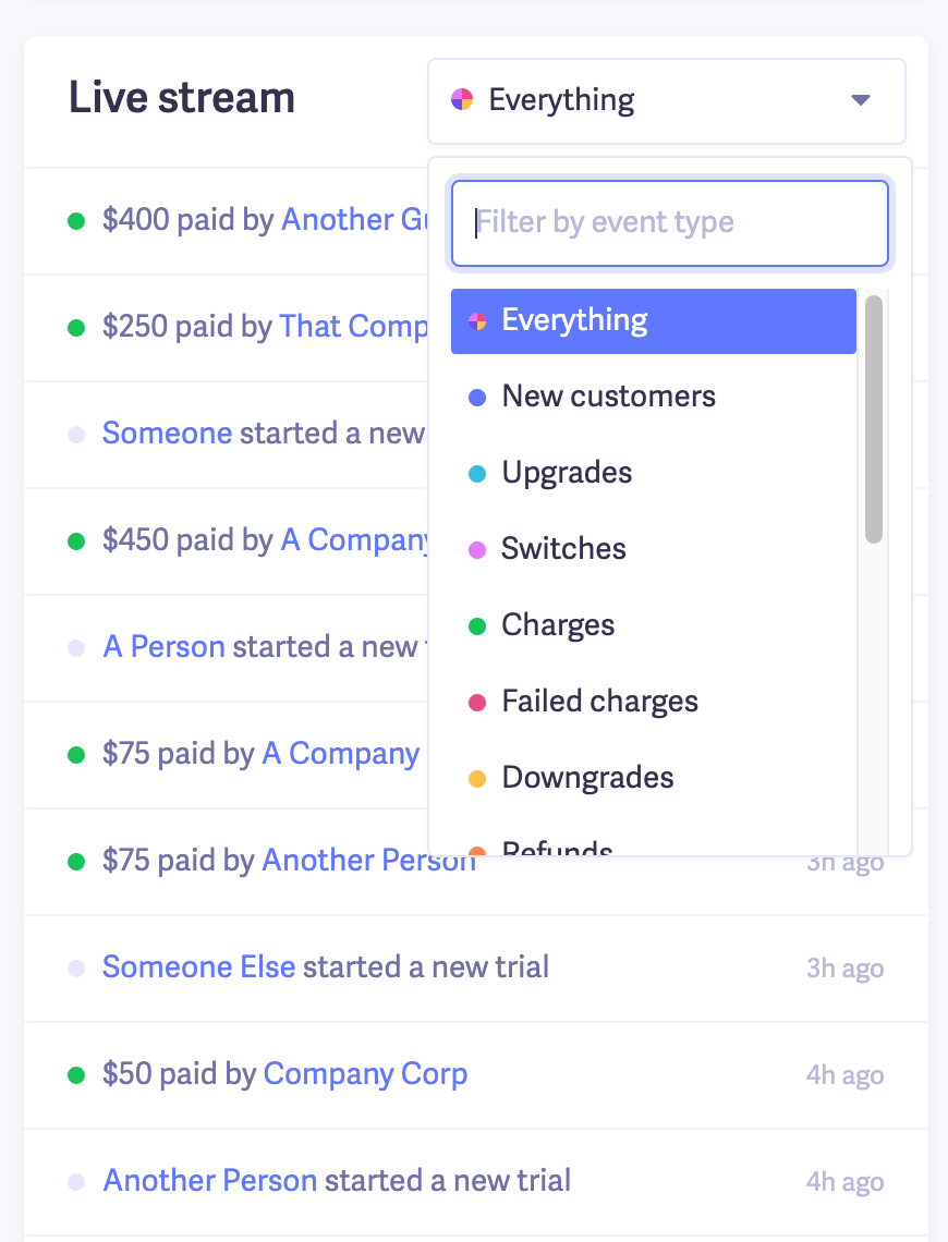
The information here is anonymized, but in your dashboard you’ll see your actual customer data
It shows you a feed of any activities customers take from new trials, to downgrades, upgrades and everything in between. And you can filter out the stream to see specific activities.
As a marketer, I love seeing new trials, converted trials and upgrades. It’s motivating, and a little addictive if I’m being honest.
The last thing I’ll mention is that you have the ability to create multiple dashboards.
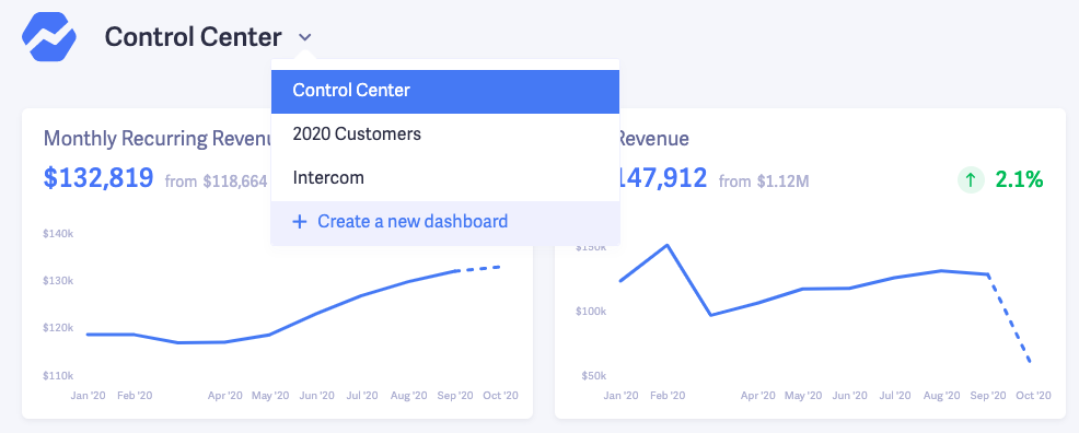
If you have multiple people on your account, everyone can create their own dashboards, and can choose whether or not they want to share with the rest of the team.
For instance, marketing might have a dashboard with their most important metrics, the finance team could have their own, etc.
If you’re interested in giving Baremetrics a try (we’re a full on SaaS analytics tool), you can sign up for a free trial here.
How to build a custom SaaS dashboard
Creating a custom SaaS dashboard is super simple. Here’s how to do it in Baremetrics.
From your main dashboard hover over the little arrow and click “Create a new dashboard”.

You’ll be given a blank slate. Also notice that you can click the “Share with team” toggle if you want to share your new dashboard with other users on your account.
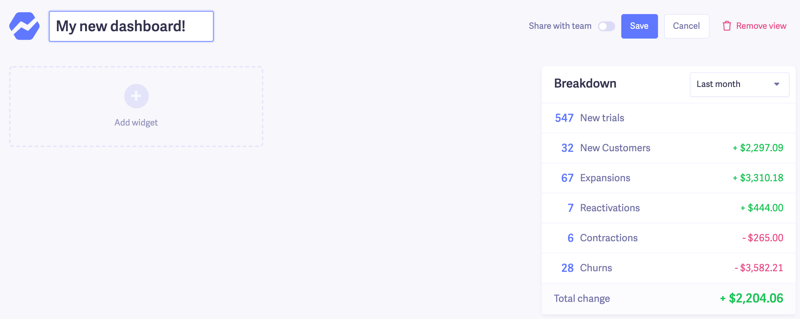
From there, you can click Add widget to start building your SaaS dashboard.
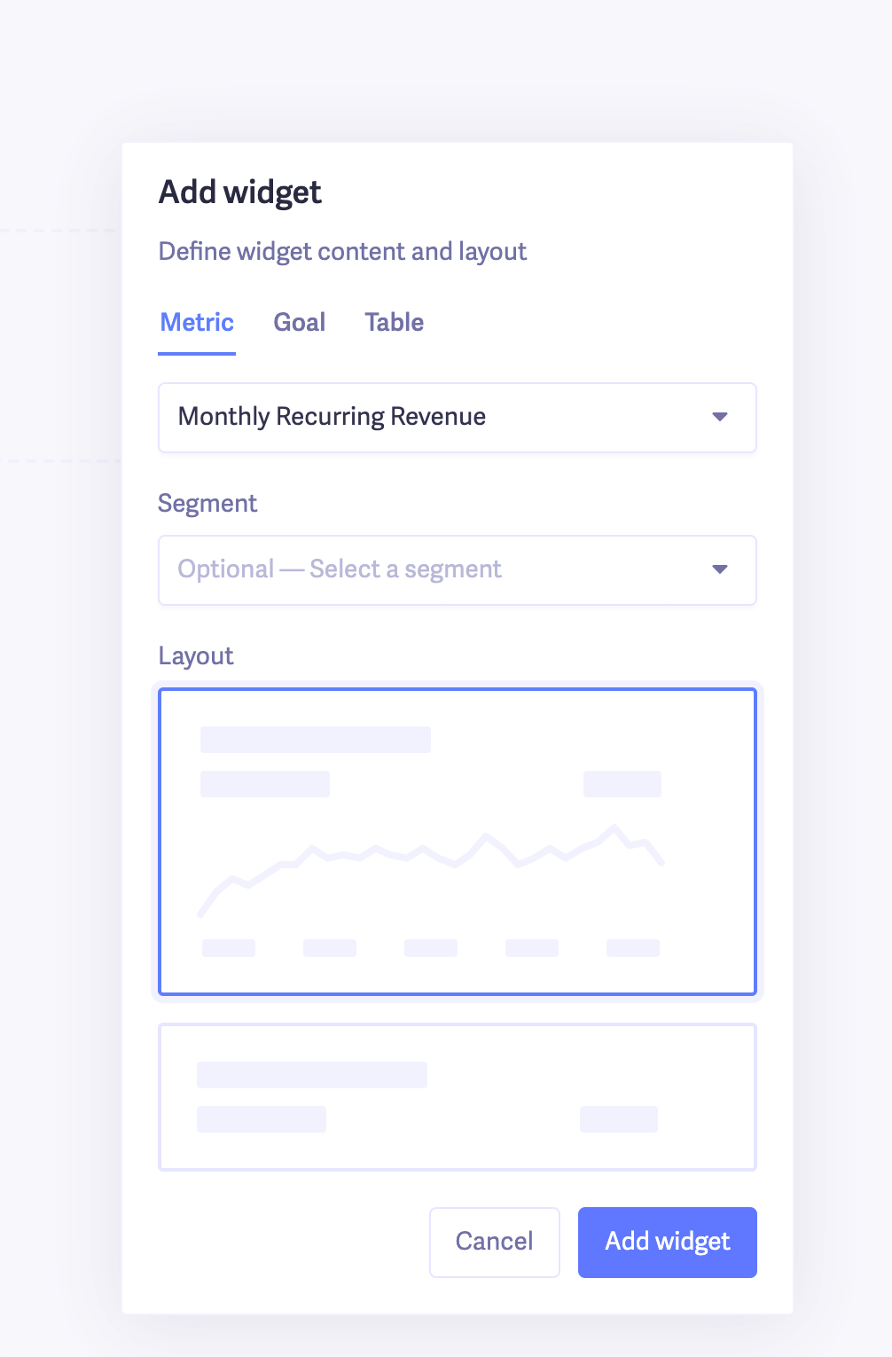
You have three types of widgets you can add to your dashboard.
The first is Metric, which you see in the screenshot above.
These are the widgets you’ll use to track your SaaS KPIs like churn, MRR, and other metrics that change over time.
You can choose two different views for your metrics—a graph or a small snapshot with just the number. Here’s what each looks like.
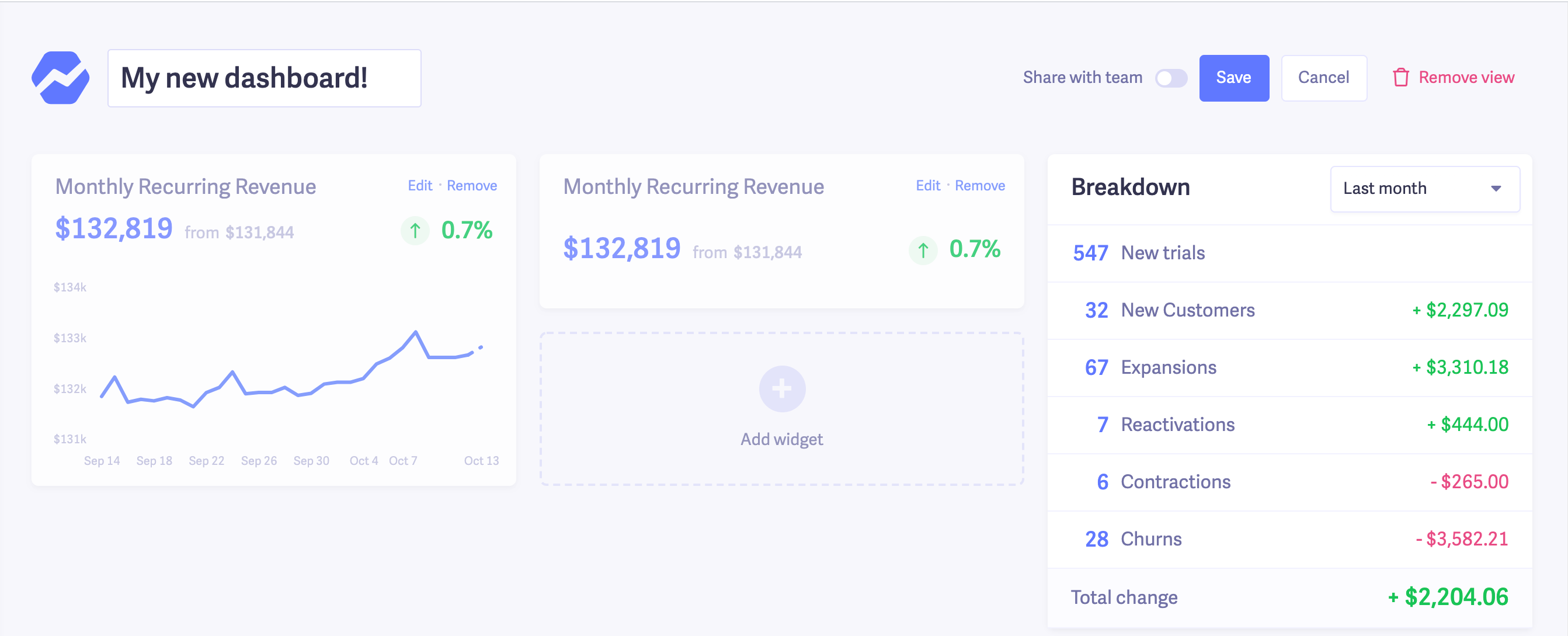
You can build a basic SaaS dashboard with just that. But if you want to take things to the next level, you can view metrics by customer segments.
For instance, let’s say I just wanted to see MRR from our customers that use Stripe as a payment processor, I’d just choose that segment from the dropdown.
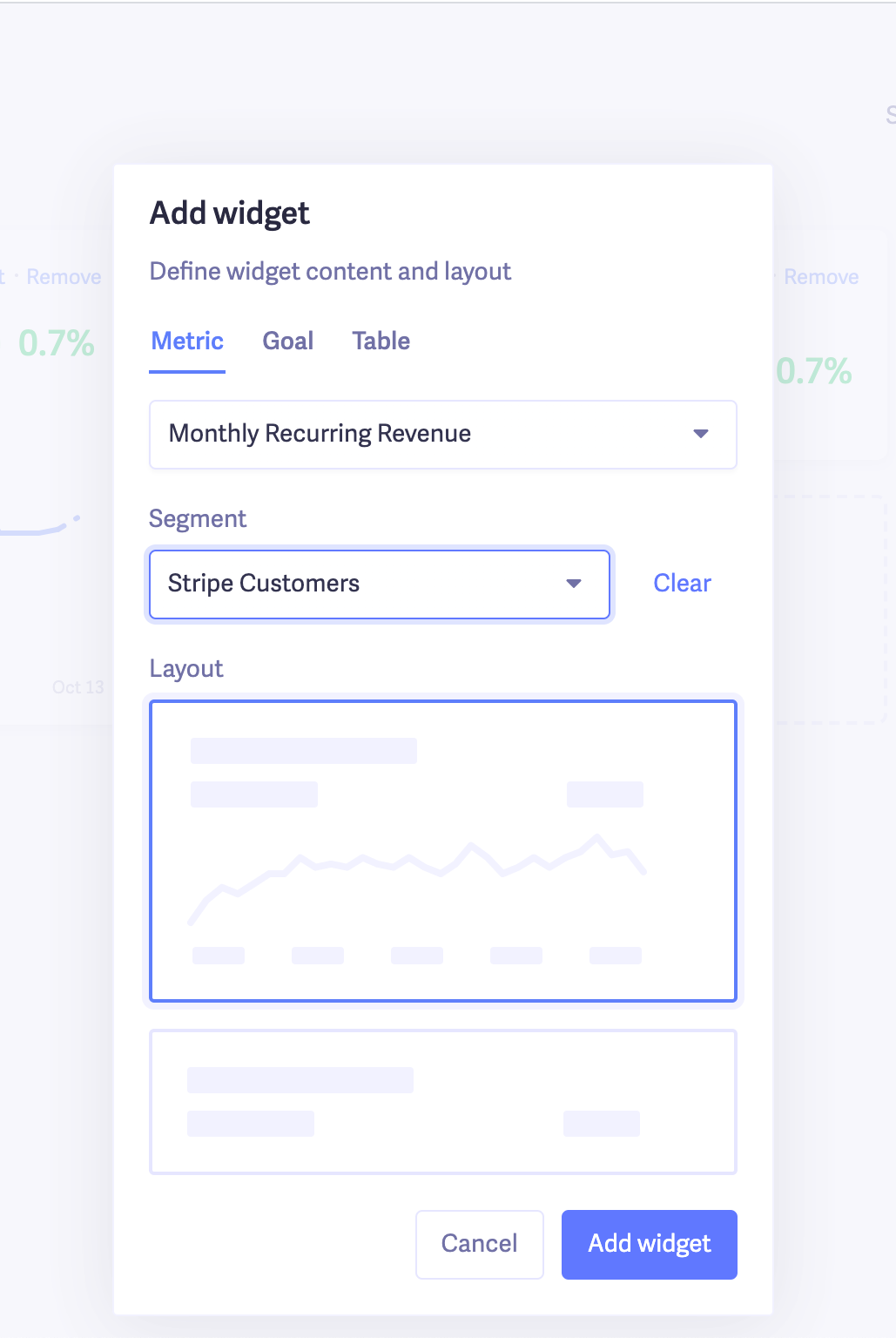
Check out this article to learn more about how segmentation works in Baremetrics.
But the short of it is you can create segments based on a ton of attributes like country, plans, UTM tags and dozens more. Plus you can pull in data from other sources like Intercom, your CRM or marketing automation tool for even more attributes.
You can probably already imagine how this can be useful, but here’s one example.
Let’s say your company serves customers in three main countries. You could create separate dashboards for each country. Or if you have three plan levels, you can create dashboards to see your metrics for each plan.
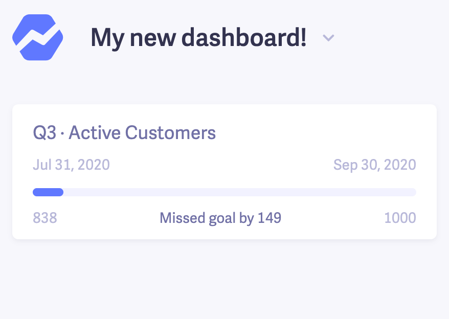
The second type of widget you can add is a Goal.
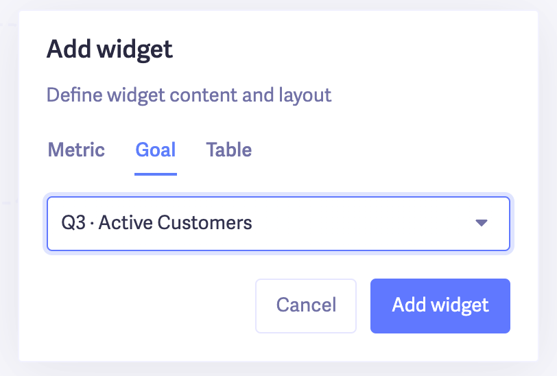
The Goal widget is pretty straightforward. It shows you how you’re pacing towards specific goals you’ve set in Baremetrics. A good way to use this is if you create a year-specific dashboard. For instance, if we create a 2020 Dashboard, we might include goals specific to this year.
Here’s how the widget looks on a dashboard.
The third type of widget you can add to your SaaS dashboard is a Table.
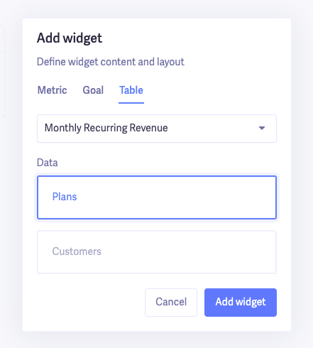
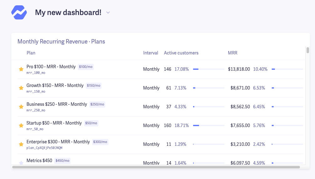
The Table widget shows you different metrics organized by your pricing plans or customers. For example, if you want to see how much MRR you get from each plan you offer, or which plans have the most churn, you can use this widget.
Now that you know all the different parts you can include in your SaaS dashboard, let’s take a look at some examples to give you inspiration to create your own.
SaaS dashboard examples
Want some ideas for your own SaaS dashboard? Here are some examples I put together in Baremetrics.
These are just examples for inspiration. You can (and should) build on top of all of these and customize them to fit the needs of your business
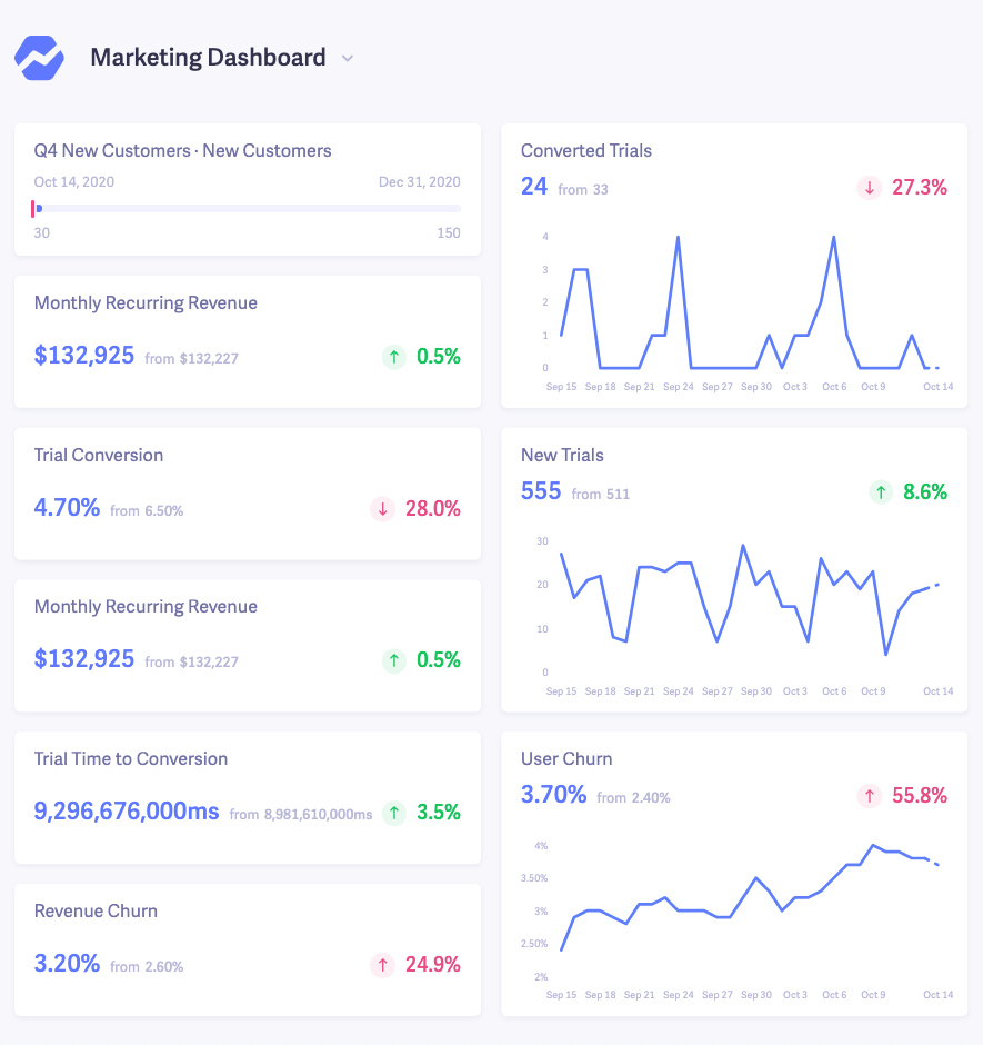
SaaS dashboard example for marketers
Depending on what your marketing role is, you’re probably interested in metrics like your free trial conversion rate, churn, and new customers. This example highlights customer acquisition, trial performance and churn.
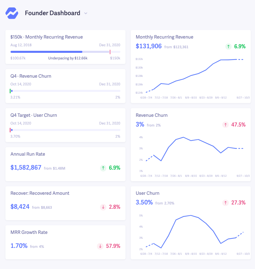
SaaS dashboard example for founders
Our default control panel we set up when you first connect your data is a great overview for most founders. But in addition to that, you can also create a custom dashboard with the metrics most important to you.
For this example, we highlighted some top level goals so you can quickly see how you’re pacing, and graphs to visualize how you’re trending towards your goals.
SaaS dashboard example for finance
If you work in finance, chances are you’re primarily concerned with… finances!
While you won’t get a complete financial report from Baremetrics, you can get plenty of data on revenue.
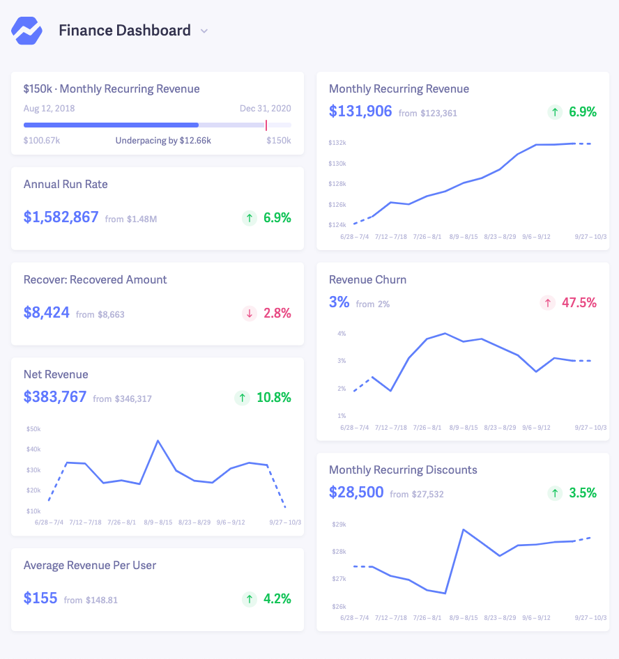
Again, these are all just examples. You can add a ton of other metrics, and create dashboards for your customer success team, engineering and anyone else in your company.
As you probably know, we’re big fans of transparency at Baremetrics. And while you don’t need to go as far as us and share your metrics with the world, you should at least share them with your team. Baremetrics makes that super simple to do.
Create your SaaS dashboard
A SaaS dashboard is one of the most important tools you can use to measure and plan your growth (and get a full picture of how you’re performing).
You can’t improve what you don’t measure, and organizing your metrics in one place is the best way to get started.
If you’re interested in creating a custom SaaS dashboard and getting actionable insights for your business, grab a free trial of Baremetrics and setup your first dashboard in one-click!
FAQ's
-
What are the essential features and components of a SaaS analytics dashboard?
Essential features and components of a SaaS analytics dashboard include visualizations (charts, graphs, tables), data filters and drill-down capabilities, real-time or near-real-time data updates, key metrics and KPIs, trend analysis, cohort analysis, and user-friendly interface. Customizability and the ability to integrate with various data sources are also important aspects. -
How can a SaaS dashboard assist in monitoring marketing performance and ROI?
-
A SaaS dashboard provides insights into marketing campaigns, lead generation, conversion rates, customer acquisition costs, and return on investment (ROI). It helps track metrics like website traffic, conversion rates, email campaign performance, social media engagement, and marketing funnel progression. With this information, businesses can optimize marketing efforts and allocate resources effectively.
-
-
How can a SaaS metrics dashboard help in tracking and analyzing key performance indicators (KPIs)?
- A SaaS metrics dashboard consolidates relevant data and metrics to track the performance of a SaaS business. It allows businesses to monitor KPIs such as monthly recurring revenue (MRR), customer acquisition cost (CAC), customer lifetime value (CLTV), churn rate, and user engagement. By analyzing these metrics on a single dashboard, businesses can gain insights into their overall health and make informed decisions.
-
How can a SaaS sales dashboard help in monitoring and optimizing sales performance?
-
A SaaS sales dashboard provides visibility into sales performance metrics such as revenue, pipeline, conversion rates, average deal size, and sales team performance. It helps identify trends, track individual and team targets, measure sales funnel efficiency, and spot opportunities for improvement. By monitoring these metrics, businesses can optimize their sales strategies, identify bottlenecks, and improve overall sales performance.
-
-
How can a SaaS reporting dashboard help in presenting data to stakeholders and decision-makers?
-
A SaaS reporting dashboard serves as a visual representation of data and insights relevant to stakeholders and decision-makers. It provides a concise and easily understandable overview of key metrics, trends, and performance indicators. By presenting data in a visually appealing and interactive manner, stakeholders and decision-makers can quickly grasp the information, identify patterns or issues, and make informed decisions. SaaS reporting dashboards can be customized to cater to the specific needs and preferences of different stakeholders, ensuring that the right information is conveyed effectively.
-


