Table of Contents

I’ve read a bunch of articles about cohort analysis. And to be honest, most of them are boring, unnecessarily technical and not actionable.
You shouldn’t have to be a data scientist or engineer to understand how to analyze customer cohorts. It’s something every founder, marketer or anyone that works in SaaS can learn to do.
So when putting together this guide, I decided to go a different route.
If you’ve ever been curious about how to do cohort analysis (not just a definition of what it is) and how to use it to improve your business—without all the jargon—this one’s for you.
Specifically, we’re going to go through how to use cohort analysis to reduce churn and retain more customers to boost your LTV. Let’s jump right into it!
What are Cohorts?
A cohort is a group of users with a common experience.
Generally, cohorts are set within a certain timeframe. You can think of it kind of like the way school graduations work. You’ll have the class of 2020, 2021, etc. All the people that graduated in those specific years are part of the same cohort.
When it comes to apps and software, cohorts are made up of your users and customers. For example:
- Users that signed up for a trial in the same month
- Users that converted to paid customers in the same month
- Users that cancelled in the same month
- Users that used a specific feature in a given time period
Using cohorts makes it easier to analyze user behavior without needing to look at each customer one-by-one. Instead, you can put customers into cohorts and look at trends within them.
You can read this article to learn more about cohorts. But for this guide, you just need to know what they are, so we can break down how to analyze them.
What is Cohort Analysis?
Cohort analysis is when you draw insights from your cohorts so you can get a better understanding of your product, marketing, onboarding and other parts of your business.
Understanding the timing of churn is only half the battle. Research from Amplitude on cohort analysis finds that the most powerful aspect of the approach is that it surfaces not just when customers leave, but the underlying behavioral patterns that predict departure, giving you something you can actually act on. That distinction matters enormously when you're deciding where to invest in onboarding or product improvements.
And one of the most common uses of cohort analysis is to improve customer retention.
By analyzing customers in cohorts, we can see things like whether customers are cancelling early on in their subscription, how product/business changes impact churn (negatively or positively), how each cohort affects revenue and other important insights.
A practical breakdown of customer retention cohort analysis confirms what most SaaS founders discover after doing this work: segmenting customers into cohorts consistently surfaces retention patterns that aggregate data masks entirely. The key is moving from observation to action by spotting the cohort where dropoff accelerates, then tracing it back to a specific acquisition channel, pricing change, or onboarding gap.
In most cases, SaaS companies analyze cohorts based on either behavior, or acquisition. Here’s a quick overview of each.
Behavioral Cohorts
Behavioral cohorts are grouped by specific actions that users take in your product.
For instance, at Baremetrics we might have a cohort of users that logged in and viewed their MRR in a specific week.
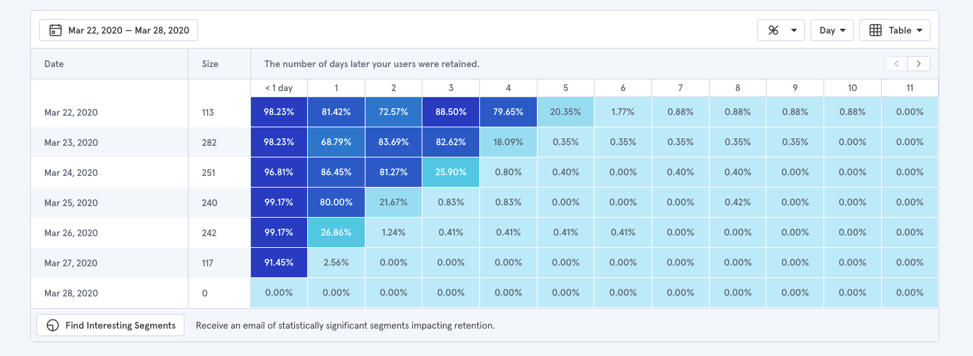
With behavioral cohorts, you need to define:
- A specific behavior
- Time period
You can use a tool like Mixpanel (or even Google Analytics) for this. Behavioral cohorts are great for understanding how users engage with your product, which features keep users coming back and other product-specific info.
If your goal is to learn how users engage with your product, then behavioral cohorts are a good option. But for our purposes, we want to focus on retention and acquisition.
Acquisition Cohorts
In order to use cohort analysis to improve churn, we need to look at acquisition cohorts. These are cohorts based on when a user signed up for your product.
For instance, people who signed up in February would be a part of the same cohort. You can track this in Baremetrics.
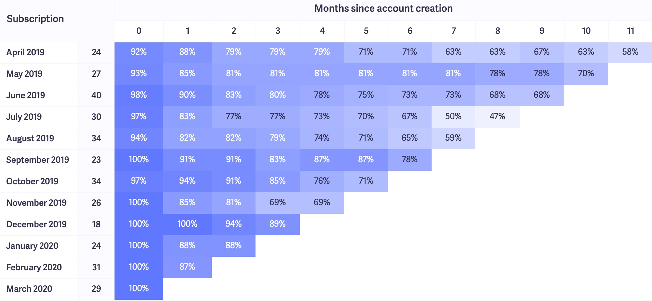
Acquisition cohorts can help you figure out the LTV of customers, average churn time and other insights related to retention. We’ll dive into all that a little later in this article.
How to read a cohort analysis chart
If you’re new to cohort charts, they can be a little confusing at first glance. But they’re actually pretty easy to read once you know what you’re looking at.
Here’s a quick overview of what our cohort charts look like in Baremetrics.
First, let’s just look at just one cohort.

From left to right, here’s what you’re looking at:
- April 2019: This is the “cohort”—customers that signed up for our product in April of 2019.
- 24: This is the number of customers in this cohort. So 24 customers signed up for our product in April 2019.
- 92%: This is the percentage of customers who remained within the first month of signing up. So in April 2019, 8% of those 24 customers cancelled.
Each column after that shows the percentage remaining customers from that cohort after each month. So under the “1” column, we can see that 88% of the original 24 customers remain after their first month, and so on and so on.
If you don’t like looking at percentages, you can also look at the data in absolute numbers. This will show you the exact number of remaining customers after each month.

Pretty simple, right?
If you want to see revenue instead of users, we also give you that data as well.
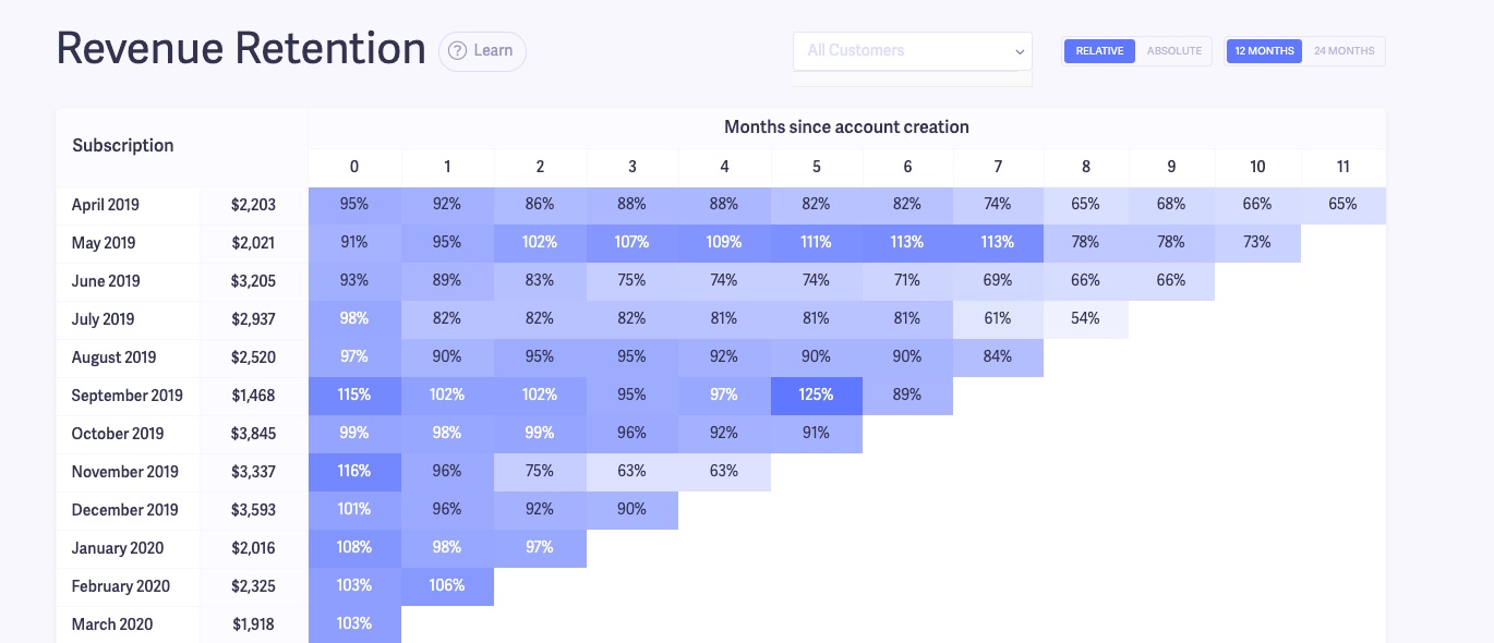
Sign up to see your revenue retention chart
Having the data and knowing how to read a cohort chart is nice. But unless you turn it into action, what’s the point?
So let’s talk about how to put these nice looking cohort tables to use.
The screenshots and tactics I’m going to cover in this guide are going to be from our product, Baremetrics. If you’re interested in getting this type of insight for your company, sign up for a free trial here and follow along!
How to use cohort retention analysis to reduce early churn
You can learn a lot about your company by looking at churn within the first couple of months of customers signing up.
Academic research on churn consistently shows that the behavioral signals preceding cancellation are detectable weeks before a customer actually leaves. One study analyzing customer churn from a strategic perspective found that early engagement patterns, specifically how customers interact with core features in the first 30 days, are among the strongest predictors of long-term retention. That's exactly why your first-month cohort data is so valuable.
For instance, let’s say your cohort retention chart looks like this:
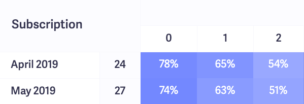
Way too many customers are churning out within their first few months of using your product.
Looking at the chart above, in the first month of signing up, this company is losing almost a quarter of their customers from each cohort. After two months, they’re down almost 50%.
The chances of this company sticking around are slim unless they figure out what’s going on.
If customers are churning after just a few months, it could be a sign of one or more of the these:
- Your product doesn’t match your customers’ expectations
- Your onboarding process needs work
- There’s an issue with how you’re acquiring/activating users
Let’s take a look at how you can use cohort analysis to identify each of these three scenarios, and how to fix them.
A mismatch between customer expectations and your product
Have you ever seen a trailer for a movie and gotten super excited about it? Then, after you watch the movie you feel disappointed and think to yourself, “that was nothing like the trailer”.
That’s exactly what happens when your customers’ expectations don’t match their actual experience of using your product.
I’m not talking about lying about what your product does or misleading people (hopefully you’re not doing that). But the mismatch can happen when you’re overselling your product, or marketing to the wrong audience.
For example, look at Trello. It’s an amazingly versatile product for project management and other tasks. But let’s say they started to market it as an alternative to full-blown CRM tools.
They wouldn’t be lying. You can use Trello as a CRM (as noted here). However, in order to use it as an alternative to popular CRMs like Hubspot, Keap and others, it requires more setup and add-ons.
If customers signed up for Trello expecting to get a more advanced CRM, they might not get exactly what they bargained for. And they’d be more likely to churn than someone who signed up looking for a more basic CRM.
Here’s one way to use cohort analysis to find out if “expectation vs. reality” is causing your customers to slip away.
First, ask for a cancellation reason whenever customers cancel their subscription. You can use Cancellation Insights for this.
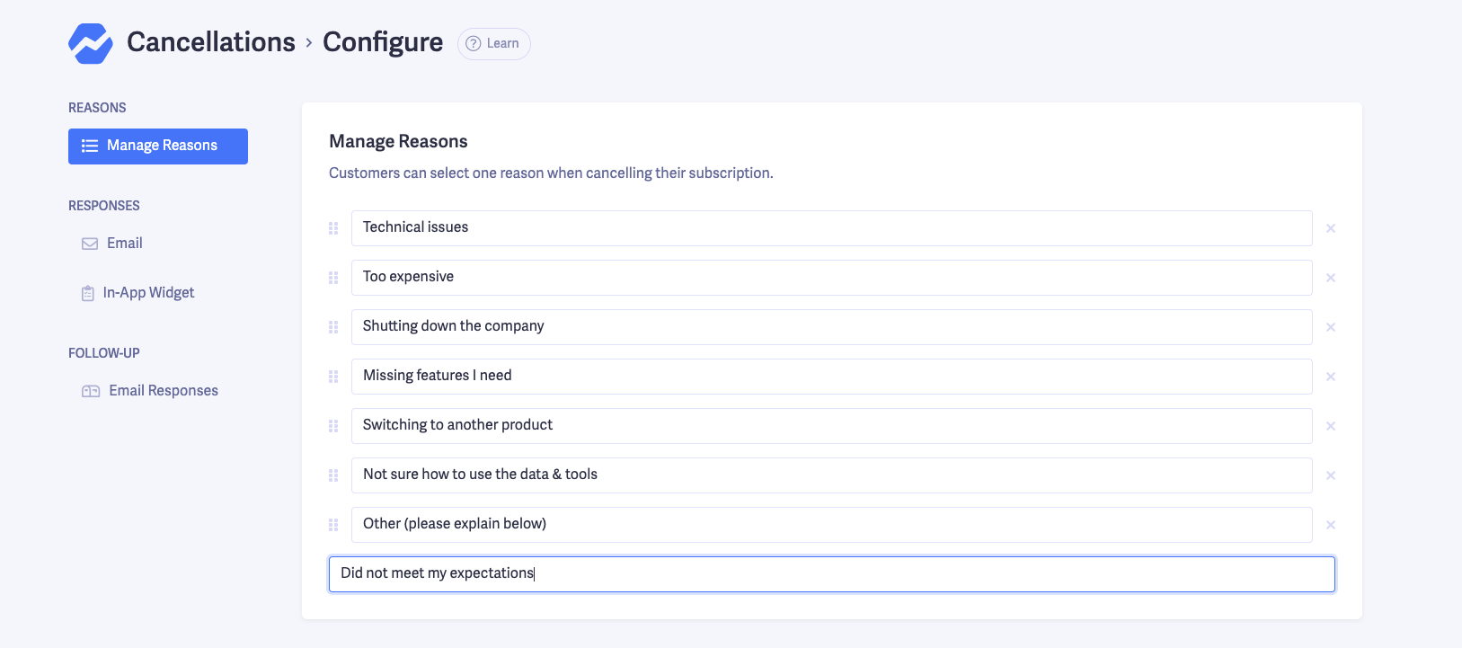
After you’ve started collecting the reasons, you’ll be able to see trends in the reasons why people cancel.
Once you have your reasons set, create a customer segment in Baremetrics specifically for people who listed their cancellation reason as something related to their expectations.
For us, that could be people who cancelled because we were missing a feature, weren’t sure how to use the data/tools or switched to a competitor.
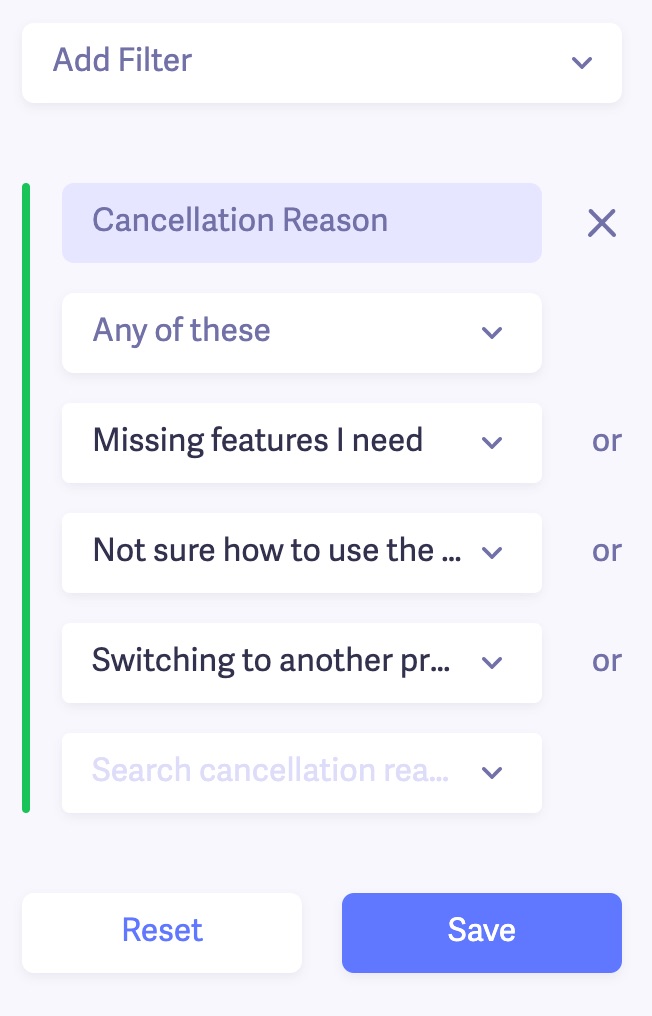
I saved this filter as “Cancellation Reason – Expectations”. Now, moving forward, anyone that cancels and includes one of these reasons will get put into this segment.
Next, we’ll head over to our customer retention cohort chart. There’s a dropdown that allows us to choose a specific segment for this cohort. We’ll choose the one I just created.
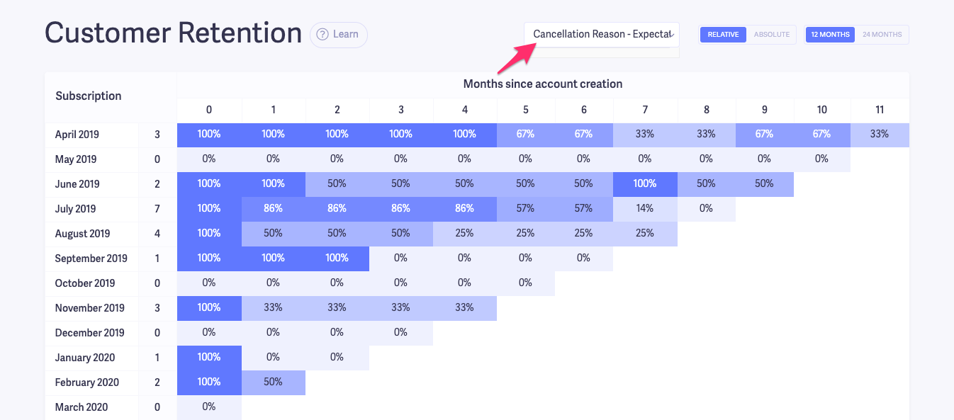
What we’re looking at in the chart above, are customers that signed up in the last 12 months, and gave one of the cancellation reasons from our filter when they cancelled.
Based on this, we can see that for the most part, people that cancel for our “Expectations” reasons tend to do it after at least a month or two with a couple of exceptions.
Since we don’t have a high volume model, we have smaller numbers. But if you’re in a business that signs up hundreds or thousands of customers a month, you’ll likely see even stronger trends.
This data is more valuable when you compare it to the total cancellations.
So let’s take a look at the two charts side by side:
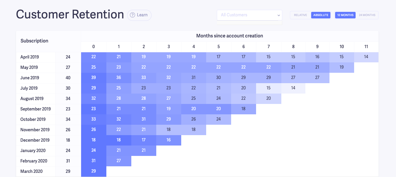
(1) The customer retention chart for all customers
(2) The customer retention chart for our “Expectations” cancellation reason segment
I’ll switch from “Relative” to “Absolute” so that we can see the actual number of remaining users each month instead of percentages.
All customers
Segmented
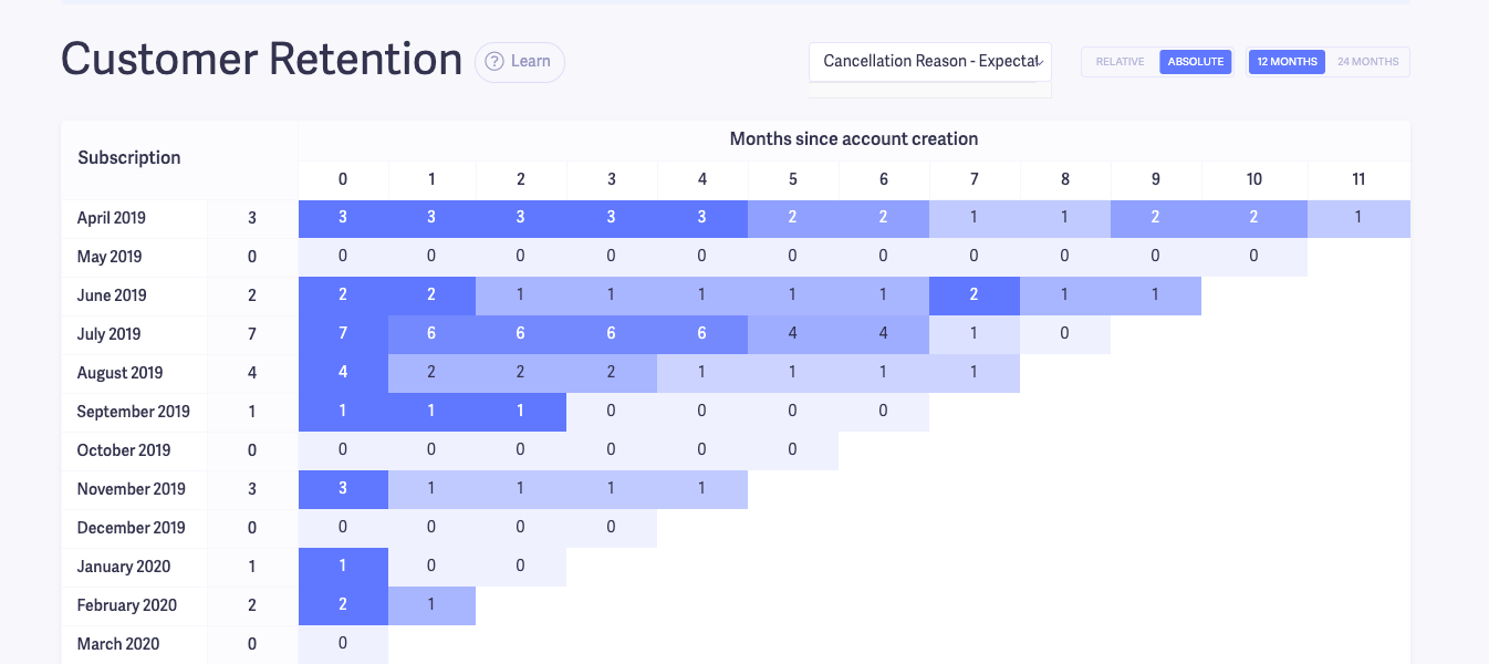
The amount of people that cancelled for one of our “expectation” reasons is very small, which is a good sign. Keep in mind though, that this example is to walk you through the process. Your findings will likely be different from ours.
The main red flag you want to look out for when you do this exercise for your business is whether or not the dropoff for customers that cancelled because your product didn’t match their expectations is worse than the overall average.
Put another way, how many customers in each cohort are cancelling because your product didn’t match their expectations?
Poor onboarding process
Another potential cause of a steep dropoff within the first few months of your cohorts, is your customers aren’t being onboarded very well. This ties into the previous tip.
If customers are cancelling because they don’t understand how to use your product, you should tinker with your onboarding process.
In order to see if your onboarding is the problem, you can follow the same steps as the previous section. Only this time, you’re specifically looking for people who gave a cancellation reason of not understanding how to use your product. You could also allow them to specifically select a reason like “Lack of onboarding” or “Poor product training”.
If the number of customers cancelling because they don’t know how to use your product is a good percentage of your overall cancellations, you know what the problem is. And at that point, you need to fix your onboarding process.
Bad acquisition/activation model
Some customers are destined to churn from the beginning because of the way they were acquired. You see this a lot when companies give deep discounts for new customers, or several months free.
Discounts are a good way to get new customers quickly. But you’ll also need to accept that it can lead to high churn in the first few months as well.
That’s exactly what History Hit found out after running a Black Friday deal. The subscription video service acquired a ton of new customers after running a promotion for Black Friday.
They were getting customers for half of their target cost-per-acquisition. But they also noticed their cancellation rate went from 6% to 9% in weeks.
Plus, their monthly LTV dropped 36% after November and their trial conversion rate went from 80% to 40%.
You can read their full journey to learn what happened and how they were able to reverse the trend. But what it ultimately came down to was the discounts they offered were so big that they attracted lower quality leads.
Remember: If you’re going to offer discounts, free trials or even go freemium, make sure it makes financial sense for your business.
SaaS Pricing Models & Strategies Demystified
Find out how to choose the right pricing model for your business!
The good thing is it’s pretty easy to find out if your acquisition or activation model is the cause of your churn by using cohort analysis. You can run an experiment where you change your activation model for a month or two and compare the results.
That’s exactly what Ahrefs did.
For over five years, they allowed anyone to use their product for free for 14 days without having to give any payment information.
This caused them to have a massive number of people using their product for free by signing up, cancelling once the 14 days were up, and then signing up again with a different email address.
At one point, they had twice the amount of free users as paying customers. And they weren’t even a freemium product.
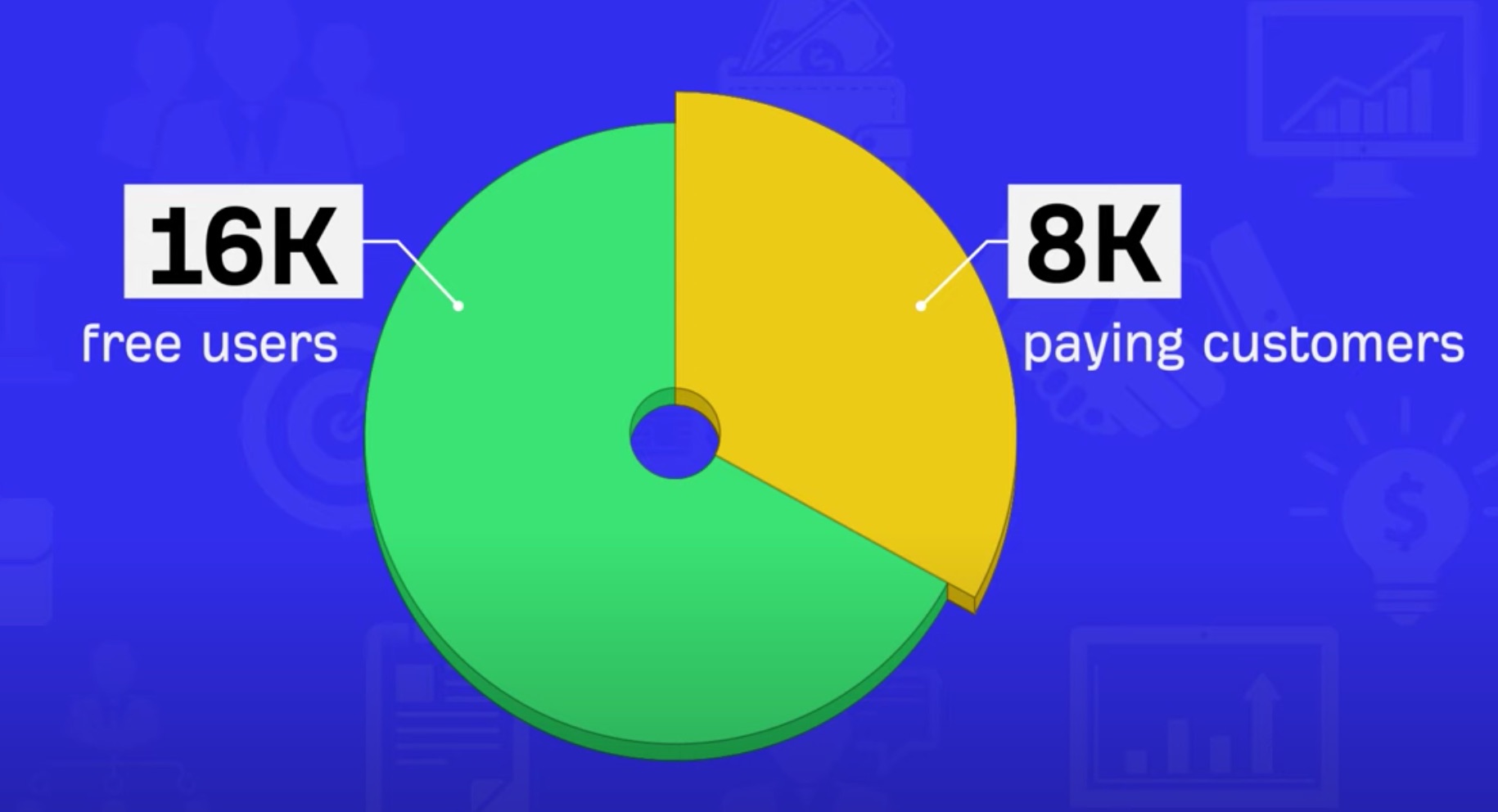
While the free trials initially got them a lot of exposure, it sucked up a lot of their resources (server costs and customer support) on non-paying customers. Long term, it wasn’t going to be sustainable.
So, they experimented with a 7-day trial for $7. And while they got fewer trials, their trial to paid conversion rate improved because they were getting higher quality users.
You can check out exactly what they did and their results in this video:
If you have a high churn rate in the first few months, try seeing if any of these three issues are the culprit. And the good thing about monitoring by cohorts is you can easily track the impact of your changes over time.
In some cases though, you’ll be able to retain customers initially. But after 6-12 months they start dropping off like flies.
Here’s what to do in that scenario.
How to use cohort analysis to improve your customer LTV
As a SaaS company (or really any business), you want to keep customers paying you for as long as possible. Doing cohort analysis will help you see how your churn is trending 6, 12, 18 or even 24 months out.
When you start using cohort analysis to improve LTV, it helps to know what good actually looks like. The most widely cited benchmark is a 3:1 LTV-to-CAC ratio, which means your customer lifetime value should be at least three times your cost to acquire them. If your cohort data shows LTV trending below that threshold, that's a concrete signal that your retention problem is also a unit economics problem.
Here’s how to do it.
Head over to your customer retention cohort table. Depending on how far back you want to look, I’d recommend switching from the last 12 month view, to 24 months.
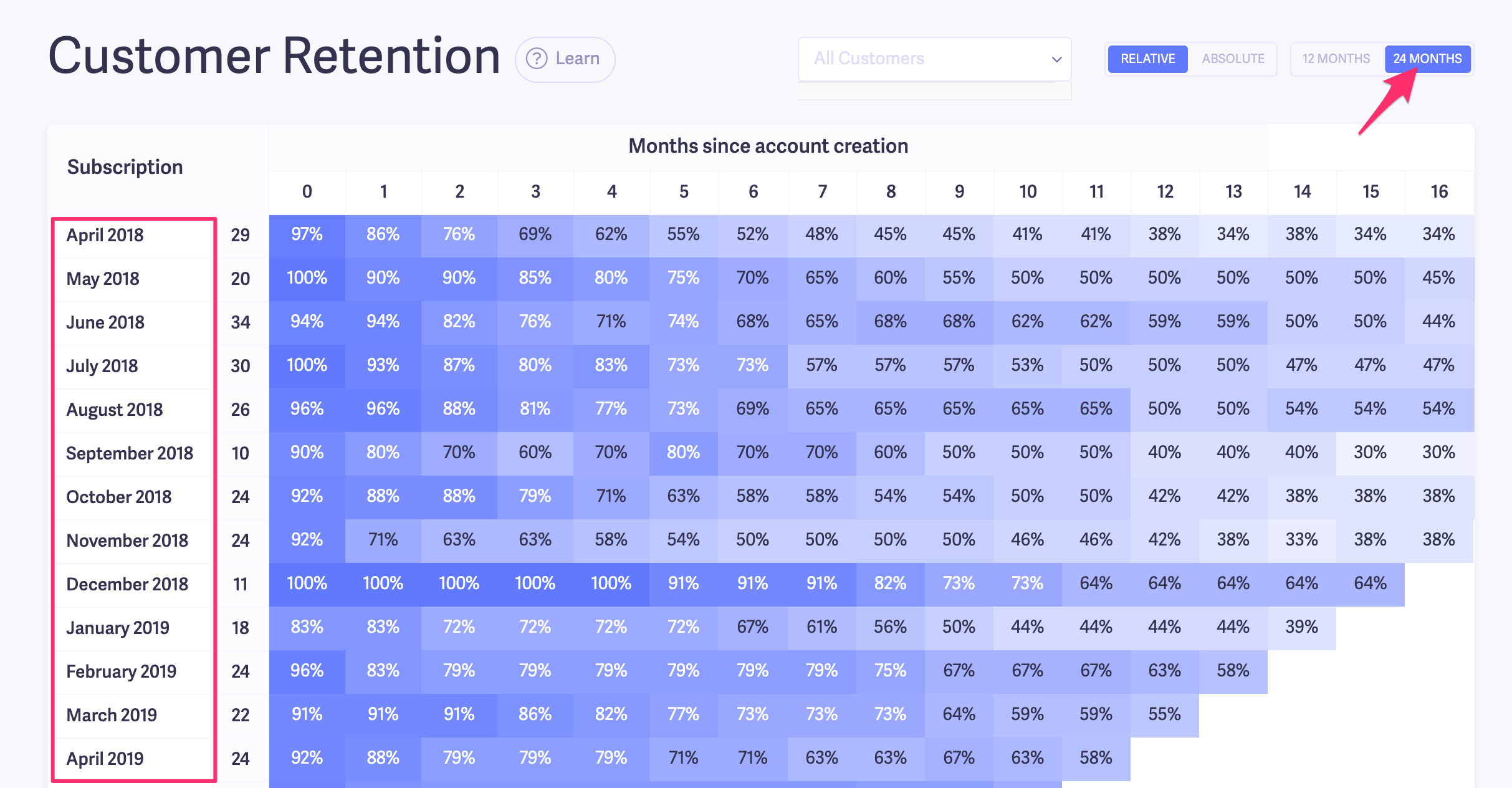
We want to focus on months 6+.
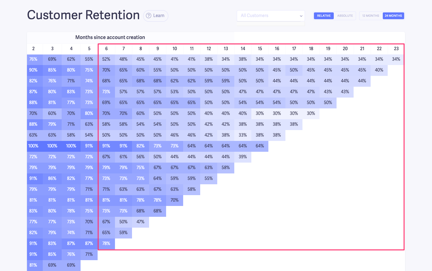
The first thing you should do is monitor how each cohort compares to your average churn time. You can see this in Barmetrics in your user churn dashboard.
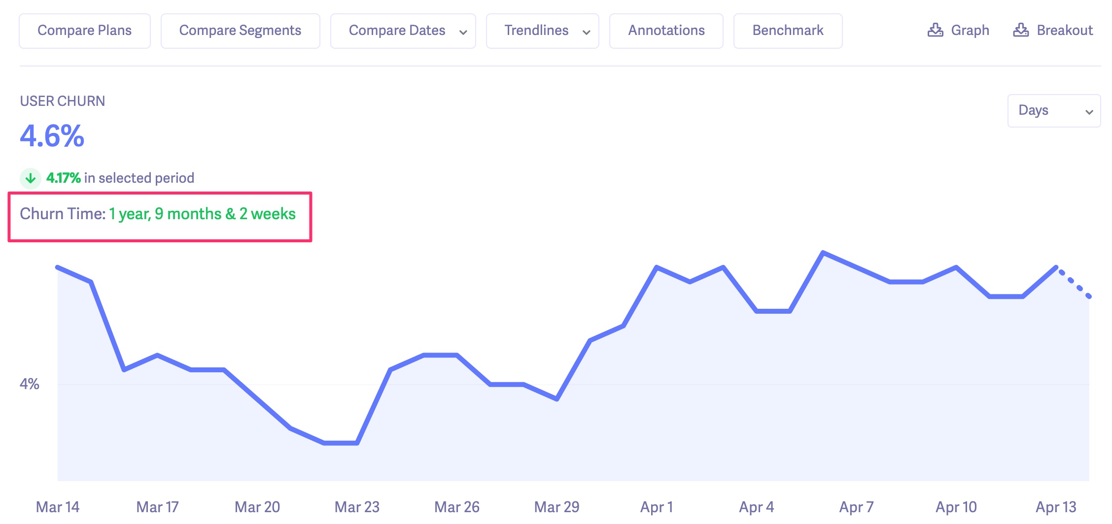
As you can see, our average churn time is ~21 months.
Looking at our cohort chart, I’d check to see if any of the cohorts have a high level of drop-off before 21 months.
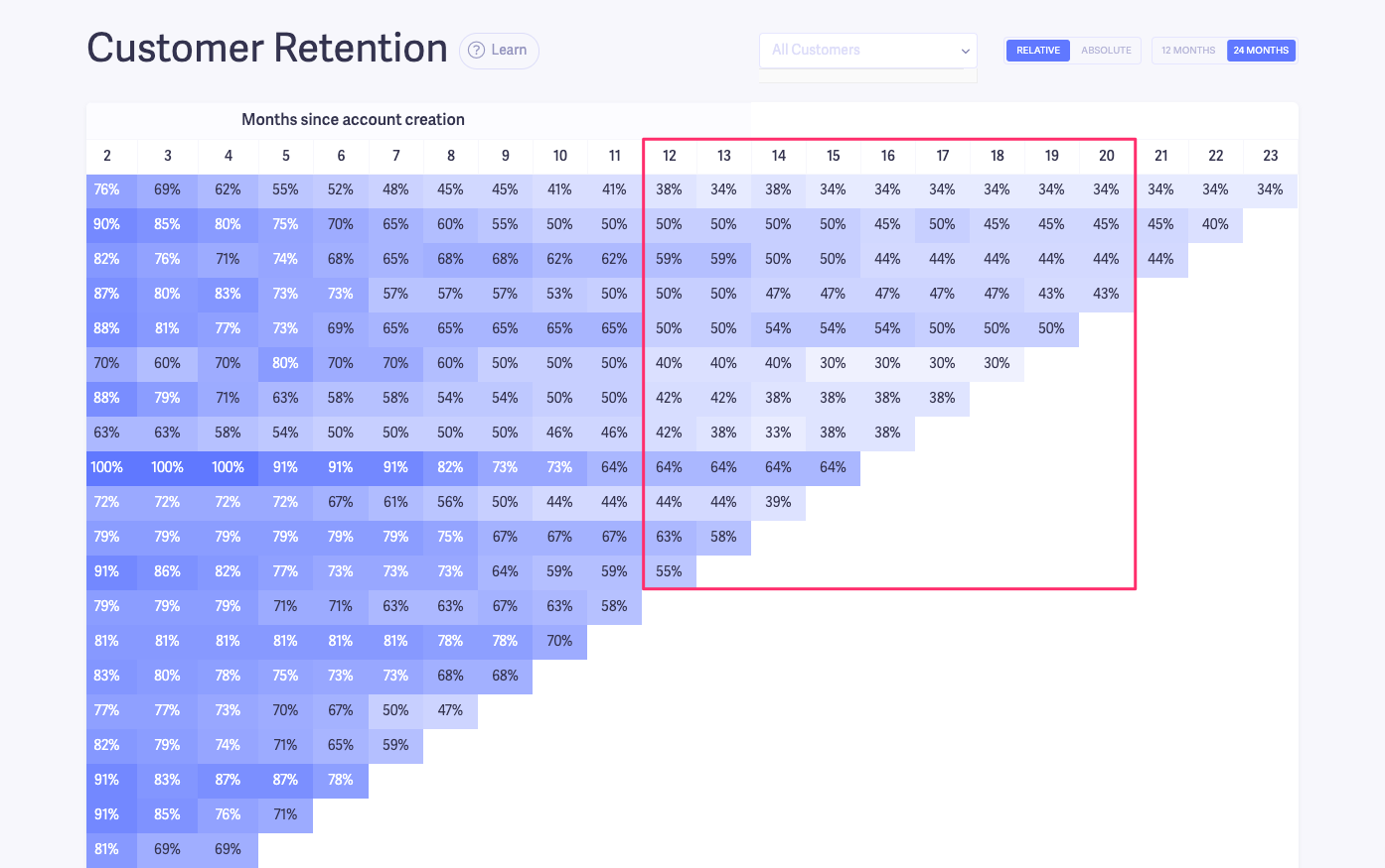
Luckily, nothing seems to be too off. But let’s say instead we saw something like this:

We can see that one cohort goes against our trend. At that point, we’d want to look at that specific cohort and see what went on. We’d create a custom segment like we did before and look at the cancellation reasons for that cohort.
But more than likely, if you have an issue with long-term churn, you’ll see it across several cohorts, not just one. And if that’s the case, here’s what you can do to change the trend.
Step 1. Find your dropoff points
First, you need to see how many months into their subscription most cohorts are falling off.
Look for clusters in your cohort chart starting from six months and beyond.
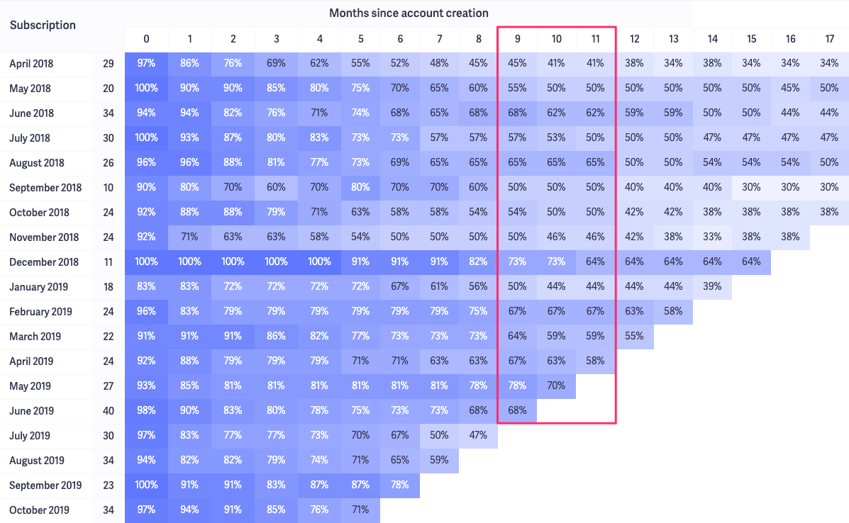
In our chart, we can see a trend starting from month 9–11. A decent chunk of the cohorts are down to around 50% by this time. If we can figure out how to improve those numbers, we can improve our LTV by retaining those customers longer.
Step 2: Check the cancellation reasons for those customers
Next, you’ll want to find out why people are cancelling in those months.
You can see a step-by-step process of how to do this in my churn analysis article where I show you how to analyze churn by cohorts.
Step 3. Check in at your dropoff point
Step 2 will show you why customers churned, and hopefully you can get some learning lessons from that.
But another thing you can do is check in with customers around a month or two before the dropoff period.
In our example, we could send “check-in” emails in months 8 and 9 of their subscription to see how things are going. That way, if there’s an issue or some kind of friction, we can save the account before they cancel.
A more long term solution, would be to have an automated email sequence (or in-app messaging) that checks in on your customers throughout their subscription. Then measure the performance of those sequences over time (open rate, engagement, etc.)
Step 4. Follow-up after the dropoff period
The previous steps will help you address the problem going forward, but what about customers who are currently in your dropoff period, or slightly after?
These people:
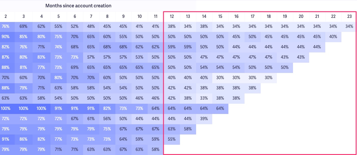
You can see that the retention rate is a bit more stabilized, but that doesn’t mean they’re not at risk of cancelling.
Even though they’ve “survived” that initial dropoff period, you should still reach out to them to make sure they’re engaged and enjoy your product.
Plus, since they’ve stayed on with you, it could be a good idea to send these users a survey to ask what they like/dislike about your product.
Compare the feedback you received from this survey to the cancellation reasons you found in step 2.
Look for similarities and differences. And use the feedback to improve your product and customer experience.
The goal is to find out what you can do to keep customers happy and pay you longer. Use the tactics above to find trends and pinpoint any potential problems.
How to use cohort analysis to optimize revenue churn
Up to this point, we’ve talked a lot about user churn. But we can also use cohort analysis to get insights into revenue churn.
One good use case for this is trying to understand the impact of discounts.
Let’s say you were curious about how discounts impact your revenue. You can look at discounted vs. full-priced customers in a specific cohort.
I’ll use our own account for this example.
In our account, we specify discounted accounts as their own plans.

So first, we need to create a customer segment to isolate discounted and full-priced customers in a specific cohort. We’ll use the April 2019 cohort for this example.
Create a custom segment with these two filters:
- Signup date: The customers from a specific cohort
- Plan: All the discounted plans you offer (If you mark your discounted customers a different way, like tagging them in your CRM, you’ll just add the appropriate filter here instead of “Plan”.)

Save that segment as something like [April 2019 Cohort – Discounted].
Then, create the same filter, but instead of “Any of these” for the Plan filter, change it to “None of these”:
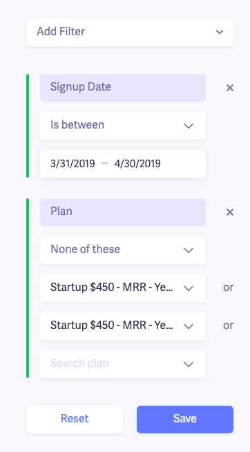
Then save that segment as something like [April 2019 Cohort – No Discount]
Now, we can use Baremetrics to compare different revenue-related metrics for these two segments.
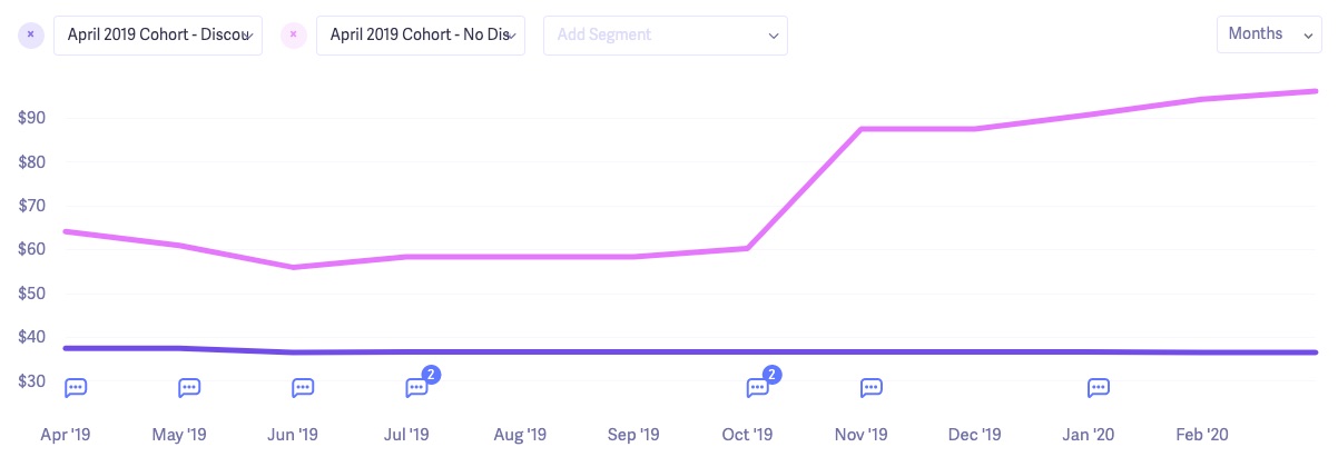
For instance, we can see which segment of this cohort has a better average revenue per user (ARPU) over time:
Track your company’s average revenue per user
The full-price customers experienced negative revenue churn some months. That means that some of our full-price customers expanded (upgraded their account or got our add-on products like Cancellation Insights and Recover).
You might find that even though you have a few more full-priced customers churn than discounted ones, they still give you more MRR than discounted customers that stay on for a longer period of time.
That’s just one example of how to use cohort analysis to analyze revenue churn. But the process can be customized depending on what you’re looking for.
In order to avoid going down a wormhole of charts and data, I suggest starting with a single problem that you want to solve. Then, use the tips above to run some analysis. Otherwise, you’ll spend all day sorting through data.
Trust me, I’ve done it.
Use cohort analysis to see the bigger picture
Breaking down your users by cohorts makes it much easier to see trends, take action.
If you have issues with churn, don’t overwhelm yourself by analyzing your entire customer base at once. Look analyze it by cohort instead. Identify the problems within those cohorts, make changes, and measure the results.
Over time, you should start to see an improvement in your churn as a whole.
Using external signals to catch cohort problems earlier
Reading cohort charts manually is still a valuable skill, but you don't have to wait until a pattern becomes obvious before you act. The key is building a workflow that gets you looking at cohort data regularly, not just at the end of the month when a drop is already weeks old. Setting up a recurring review cadence, even just a weekly check on your retention table in Baremetrics, means anomalies surface while there's still time to intervene rather than after the damage is done.
The practical shift is moving from reactive to proactive: instead of pulling your cohort chart to explain why churn went up, you're using it to spot which cohort is trending worse than your baseline before those customers officially decide to leave. Your average churn time in Baremetrics gives you a benchmark: if a cohort is tracking below that line at month three, that's your cue to investigate, not month six.
The key mindset shift is treating cohort review as an early-warning habit, not a post-mortem exercise. If you notice a cohort deviating from your norm and you don't know why, that's where the manual investigation this guide covers earns its keep. Set a baseline retention benchmark using your historical cohort data, check against it on a regular schedule, and use the segmentation and cancellation reason workflows described above to diagnose the root cause before it compounds.
FAQ
-
What is cohort analysis and why does it matter for SaaS retention?
Cohort analysis is the practice of grouping customers by a shared characteristic, typically their signup date, and tracking how those groups behave over time.
For subscription businesses, this approach surfaces patterns that aggregate data hides entirely. Instead of looking at your overall churn rate, you can see which specific groups of customers are dropping off, and when. That distinction matters because it tells you whether early churn is a product problem, an onboarding problem, or an acquisition problem. A SaaS founder analyzing cohorts by signup month, for example, can quickly spot whether a pricing change or a product update improved retention for customers who joined after it shipped, compared to earlier user segments. -
How do I use cohort analysis to reduce early churn in a subscription business?
To reduce early churn, run an acquisition cohort analysis that tracks the percentage of customers still active at the end of each month after signup, then look for where the sharpest dropoff occurs.
If a large share of each customer group cancels within the first one to two months, the likely causes are a mismatch between marketing promises and product reality, a weak onboarding flow, or poor-fit acquisition channels. Pairing your cohort retention chart with cancellation reason data makes this diagnostic much faster. In Baremetrics, you can apply a customer segment filter directly to the cohort chart, so you can isolate users who cancelled for expectation-related reasons and compare their retention curve against your overall subscriber base to see exactly how much that specific issue is driving early churn. -
What is the difference between behavioral cohorts and acquisition cohorts for SaaS?
Acquisition cohorts group customers by when they signed up, while behavioral cohorts group them by a specific action they took inside your product.
For churn reduction and retention analysis, acquisition cohorts are the more useful starting point. They let you measure LTV, average churn timing, and the impact of product or pricing changes across distinct customer groups over time. Behavioral cohorts, on the other hand, are better suited for product engagement questions, such as which features correlate with long-term retention or which user segments reach activation milestones. Most SaaS teams use acquisition cohorts to diagnose churn problems and behavioral cohorts to test solutions. -
How can I measure and reduce involuntary churn caused by failed payments?
Involuntary churn from failed payments is best addressed by automatically retrying failed charges before the subscription lapses, combined with proactive dunning emails that prompt customers to update their billing details.
This type of churn is easy to overlook because it never shows up in cancellation surveys, but it can account for a significant share of total MRR loss. Baremetrics includes a feature called Recover that automates failed payment retries and dunning sequences directly on top of your Stripe, Braintree, or Recurly data. Unlike manual processes, Recover acts on real-time billing events, which means fewer customers fall out of your subscriber base before you even notice there was a problem. Tracking involuntary churn separately from voluntary churn also gives you a cleaner picture of your true retention rate. -
What platforms offer cancellation surveys that feed directly into retention analytics?
Baremetrics includes a built-in Cancellation Insights feature that collects cancellation reasons from churned customers and connects that data directly to your subscription analytics.
This matters because cancellation reason data becomes far more useful when you can segment your cohort retention charts by it. Instead of knowing only that customers churned, you can see whether the customers who cited a missing feature churned faster than average, or whether expectation-related cancellations cluster in specific acquisition cohorts. That kind of segmentation turns qualitative feedback into a quantitative signal. Most standalone survey tools require a separate integration to get anywhere close to this level of analysis for subscription businesses. -
How can I benchmark my SaaS churn rate against similar subscription companies?
Baremetrics publishes open benchmark data drawn from hundreds of real SaaS companies, letting you compare your churn rate, MRR growth, and LTV against businesses at a similar revenue stage.
Benchmarking churn is most useful when you filter by company size or MRR range, since a 5% monthly churn rate means something very different for a $50K MRR business than for one at $2M MRR. Beyond raw churn rate, it is worth benchmarking net revenue retention, since expansion MRR from upgrades can offset subscriber losses entirely. Knowing where your numbers sit relative to the broader SaaS market helps you prioritise whether retention or acquisition deserves more investment right now. -
When should a SaaS founder start doing cohort analysis, and what do they need to get started?
Start cohort analysis as soon as you have at least two or three months of subscription data and more than a handful of paying customers, because even small datasets reveal patterns that aggregate metrics obscure.
You do not need a data science team or a complex analytics stack to run a cohort analysis for a subscription business. The core requirement is clean billing data from your payment processor, Stripe, Braintree, or Recurly, and a way to group customers by signup month and track their retention over time. Baremetrics connects directly to those payment processors and generates cohort retention charts automatically, with no SQL or manual spreadsheet work required. For early-stage SaaS founders, this is often the fastest way to go from raw transaction data to an actionable view of churn and LTV.


