Table of Contents

Churn analysis is the process of examining customer data to understand why users cancel their subscriptions, identify patterns in cancellation behavior, and develop data-driven strategies to improve retention. It goes beyond simply knowing your churn rate — churn analysis answers why customers leave and what you can do about it.
Key takeaways:
- Churn analysis can help you understand your company's churn rates and why customers are canceling
- It's important to understand which customer segments are churning and why
- Discovering cancellation reason trends can help you identify specific reasons customers are churning in large numbers so you can adapt as needed
- Sometimes, high churn rates for reasons like pricing may indicate that you're not targeting the right audience
- Tools like Baremetrics can help you conduct a churn analysis, providing clear metrics, cancellation insights, and even help prevent involuntary churn
Picture this: Over the past six months, your churn rate has gone from a respectable 4%, to now, over 10%.
Confused (and probably a little worried), you scratch your head and wonder what in the world happened?
At this point, you could go into panic mode and make random, drastic changes to your business to stop the bleeding.
Or, you can pause, take a step back and analyze what went wrong by doing some churn analysis.
Understanding Customer Churn Analysis
Churn analysis is the use of customer data to understand why they stopped using your service. The higher your churn rate, the more users, and revenue, you are losing. Churn rate is a crucial metric for calculating other metrics like Customer Lifetime Value (CLV).
Customer churn rate is the percentage of customers who cancel their subscriptions within a given time period. It is calculated by dividing the number of customers lost during a period by the number of customers at the start of that period.
Analyzing your churn doesn't only mean knowing what your customer churn rate is. It's about figuring out why customers are churning at the rate they are, and how to fix the problem.
While similar, churn analysis and churn prediction aren't the same. Churn analysis helps you understand why customers are cancelling, so you can make a plan to reduce it. Churn prediction is forecasting the likelihood that a customer will churn based on feedback and historical data, so you can plan ahead. Learn more about churn prediction here.
| Aspect | Churn Analysis | Churn Prediction |
|---|---|---|
| Focus | Understanding why customers already churned | Forecasting which customers will churn next |
| Data Used | Cancellation reasons, cohort data, revenue segments | Behavioral signals, usage patterns, engagement scores |
| Timeframe | Retrospective (looking back) | Prospective (looking forward) |
| Outcome | Actionable insights to reduce churn rate | Early warning system for at-risk customers |
| Tools | Baremetrics Cancellation Insights, spreadsheets | Machine learning models, predictive analytics |
Why You Need to Analyze Churn
It's one thing to know that you have a 13% churn rate. But unless you understand which customers are cancelling, why they're cancelling, when they're cancelling, and other data points, it's really hard to improve.
That's why churn analysis is so important for subscription businesses.
We've run into situations where a SaaS company will recognize that they have a problem with customer retention but aren't sure how to fix it. So they resort to making assumptions or randomly using tactics they've found online.
The problem with that, is unless you understand the "why" behind your SaaS churn, any changes you make could potentially make the problem worse.
And when you're already dealing with high churn, the last thing you need is to lose more revenue by changing your pricing, features and processes with no rhyme or reason.
When you take the time to analyze why customers are churning, you have a clearer idea of what to change. Then, you can do some controlled tests to measure the impact to improve retention and potentially get closer to that ideal negative churn rate.
How to Calculate Customer Churn and Analyze the Results
Once you've calculated your churn rate, it's time to conduct a full churn analysis to learn what's driving those numbers.
The first thing you should ask is, what problem are you trying to solve?
In this case, we want to understand how to reduce our churn. In order to do that, we'll need to answer two main questions:
- Which customers are churning?
- Why are they churning?
With those two questions as our starting point, we have context and direction for how we look at our data. That'll make it less likely to go down a wormhole of endless data with no end in sight.
Now that we know what we're looking for, let's dive into a step-by-step guide to churn analysis.
Step 1: Setup Churn Analytics Tools
This isn't even step number one. It's more like step 0. Before you can do any type of churn analysis, you need to have data to analyze!
There are many tools available that could help, but let's keep things simple for now.
You'll need some type of subscription analytics tool. For this post, we'll be using Baremetrics.
You can access all the information you need right from within our dashboards, and you can export the data into a spreadsheet if you want to explore it further.
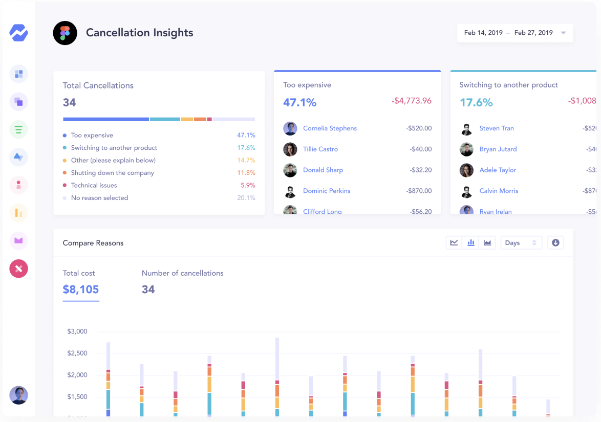
See essential churn data like the following:
That said, you can also use tools like Mixpanel or Amplitude. These tools let you understand how people use and engage with your product.
You can discover information like the following:
- "Sticky" features that users return most often to use
- Features with low usability.
- Average number of sessions or session length
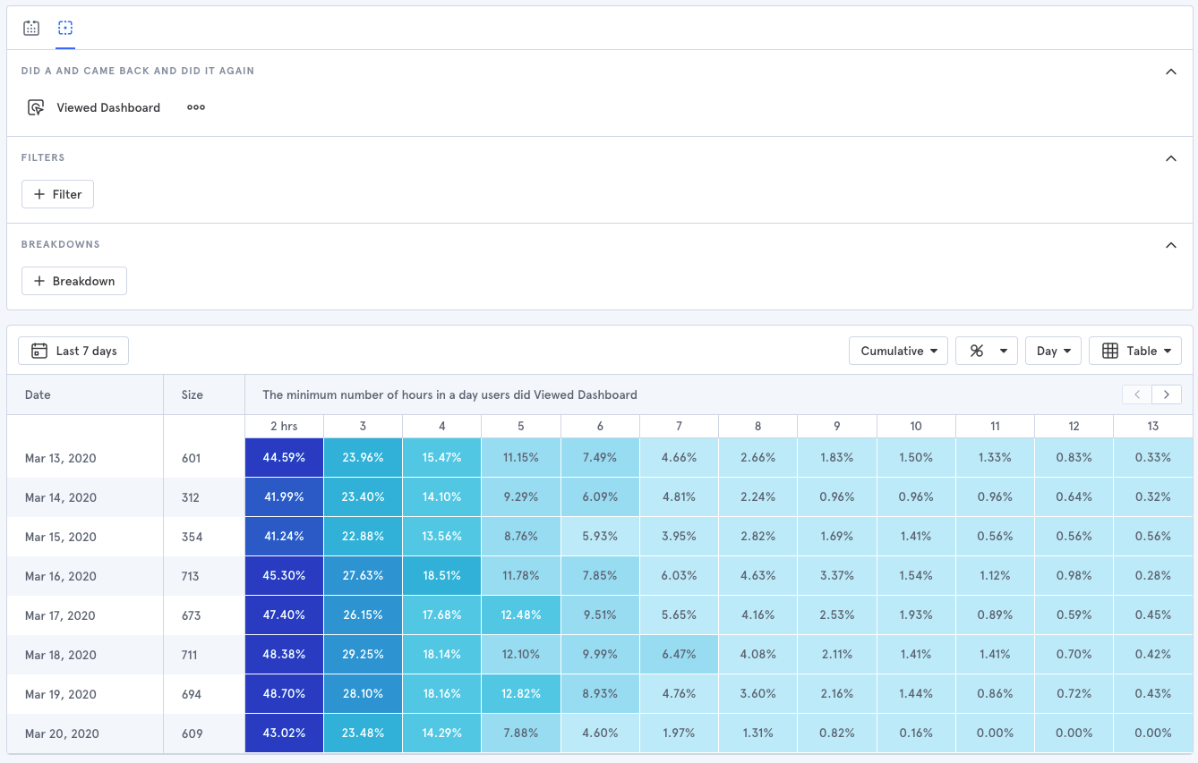
Product engagement can be a big indicator of churn, so this data can really come in handy.
Mixpanel has a great series of videos on how to analyze user behavior.
Try not to get fixated on all the different tools out there, though. Start with the basics when it comes to churn analytics tools like Baremetrics, and if you can't get the insights you need, then branch out.
Step 2. Find Out Why Customers are Churning
I mentioned that one of the two questions we're going to answer with our churn analysis is "Why are people canceling?"
To get those answers, you need to start asking! There are a couple of ways to do this.
Option A, Send an email after customers cancel. They'll either ask customers why they canceled directly in the email or direct them to a questionnaire which can easily be made through a tool like Google Forms or Typeform.
Here's an example from Pat Walls, owner of Pigeon. He sends out an email to all customers that cancel and asks for feedback.
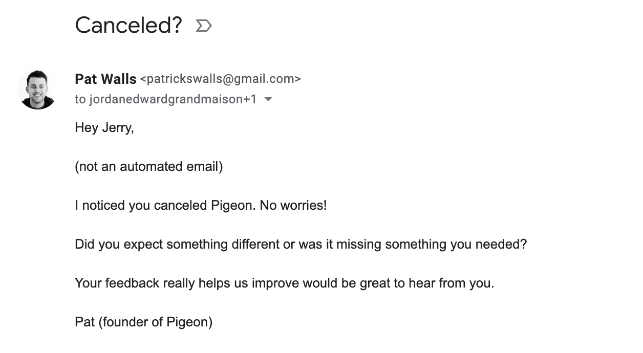
Short, clear, and simple.
This approach works well in the early stages of your SaaS company. But as your business grows, you'll want a more scalable way to discover why customers are churning. That's where Option B comes in.
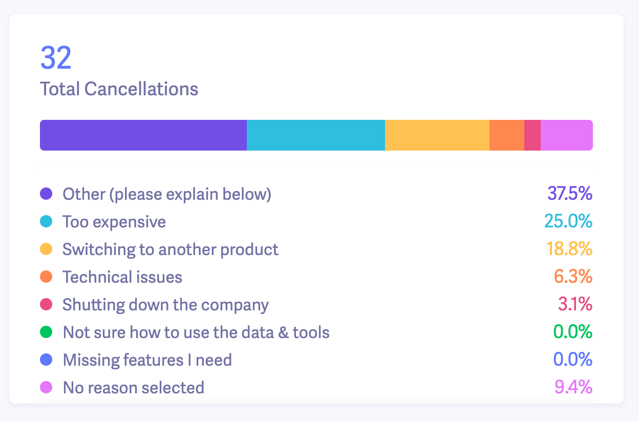
Here's what we do at Baremetrics. We use Cancellation Insights to create a questionnaire for customers to answer before they close their accounts, along with an email option.
It looks like this:
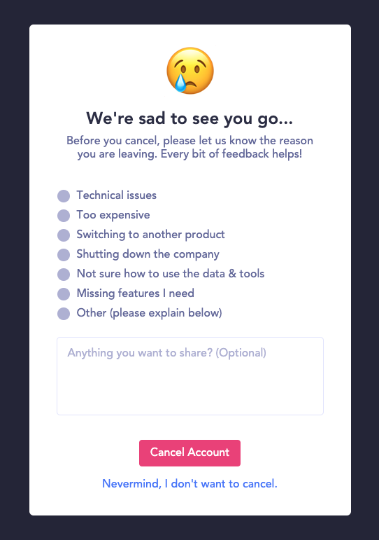
The form captures all the customer responses and we're able to track every response in our dashboard.
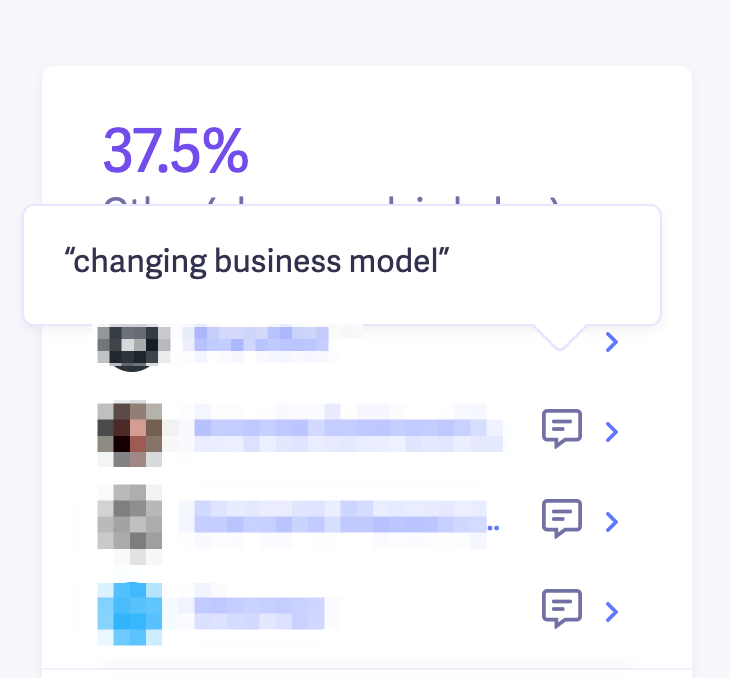
We also allow people to provide more details about why they're canceling, which is particularly helpful for customers who chose "Other" as their cancellation reason.
We can do some basic churn analysis with this info alone.
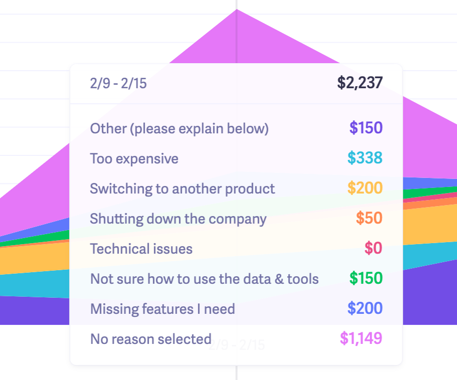
For instance, we can examine the most common reasons people churn and see exactly how much MRR we're losing each month from each reason.
Understanding Cancellation Reasons
For cancellation reasons like "Too expensive", you'll need to do more digging. But don't worry, we'll dive into ways to analyze that a little later. This data can help you prioritize your next steps.
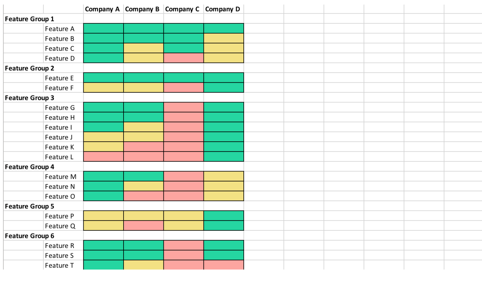
For instance, if customers choose "Switching to another product," take these steps:
- Note which competitor they're switching to
- Create a feature comparison matrix (like this one from Crayon)
- Look for competitive differentiators like price, key features, or functionality
If pricing comes up as a consistent cancellation reason. you'll want to conduct market research and consider running pricing tests.
A word of caution, though. If you notice pricing is a consistent cancellation reason, that doesn't automatically mean you need to charge less!
It could mean that you need to provide a little more value to justify your current price or the customers that canceled were on the wrong plan.
Here's a note from Baremetrics head of growth, Corey Haines, on why lowering your price isn't always the "fix" for churn.
"Too expensive" is one of the most common cancellation reasons across every business. But before you assume your product is priced too high, consider what I like to call, the value:price ratio.
A 1:1 value:price ratio means customers are getting just as much value as they're paying for, and while this seems reasonable, they'll likely feel that they're not getting much out of it and will try to find something at a lower price.
Whereas with a 10:1 value/price ratio, customers will practically feel obligated to tell others about it and stick around for a long, long time.
We ran a pricing experiment fairly recently where we doubled pricing and virtually saw no difference. So that was a good indicator that our price, in fact, was not too high.
Another interesting example is that we did see a lot of pushback from our $100/mo plan by customers upgrading from the $50/mo plan. And often a lot of responses from trialing users, who didn't convert, that they just couldn't justify $100/mo at their revenue.
So we introduced a new plan in between the $50/mo and $100/mo at $75/mo and have seen very little churn from that plan and virtually no pushback from customers upgrading to that plan now.
Another thing to consider is the type of churn you're getting. Are your customers cancelling, or are they just not paying you?
In Baremetrics, you can see a breakout of your churn by cancellations vs. unpaid.
Monitoring for Involuntary Churn
Involuntary churn is a type of customer churn that occurs when something happens that results in customers accidentally failing to retain their subscription. The most common type of involuntary churn happens when customers have an expired or canceled credit card that they fail to update.
Dunning methods can help you identify users at-risk for involuntary churn, preventing a cancellation before it happens. Use Baremetrics Recover to stop churn in its tracks.
Step 3. Analyze Customer Churn Rate by Cohorts
Cohort analysis is a method of grouping customers into segments (cohorts) based on shared characteristics — such as signup date or plan level — to identify patterns in retention and churn behavior over time.
Imagine you're a SaaS company selling budgeting software. Over the past three months, you've lost 300 customers.
Those 300 customers were on different plan levels, signed up at different times, and are in different countries.
Do you think it'd be more effective to analyze all 300 customers at the same time, or group them into "buckets" based on plan level, subscription date and location?
If you analyze your churn the first way, you might be able to see some high-level trends.
But to get more actionable insights, it's much more beneficial to take the second route and break down your churned customers into smaller segments or cohorts.
Two good cohorts to start with are plan level and subscription date.
First, let's look at an example of how to do churn analysis by price point or plan level.
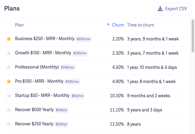
To get a quick overview of which plans have the most churn in a certain month, you can go into Metrics > User Churn in Baremetrics. Scroll down slightly, and you'll be able to see a list of all your plans and the churn rate for each.
Once you identify which plans have the highest churn for any given month, you'll want to zero in on why those specific customers are canceling. We'll use a spreadsheet here.
Head over to Cancellation Insights and select your date range. Then go down to the list of customers and Download Table.

In the spreadsheet, you can sort the data by plan and see the specific cancellation reason for all the users who canceled under that plan.
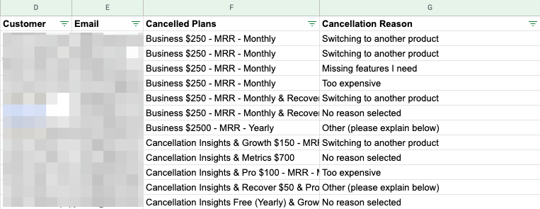
It's not pictured in my screenshot, but you can see the comments for each cancellation reason in the spreadsheet. From there, you'll want to look for any trends in cancellation reasons by plan level.
Another way to analyze churn by cohorts is to look at customer retention by signup date. You'll look at all the customers who signed up during a certain month and see how many months they stayed on afterwards.
Don't worry, it's simple to do.
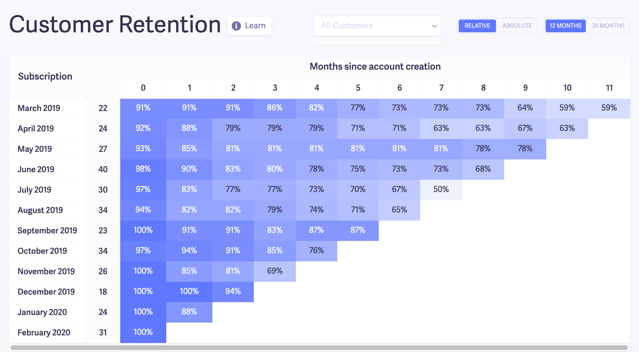
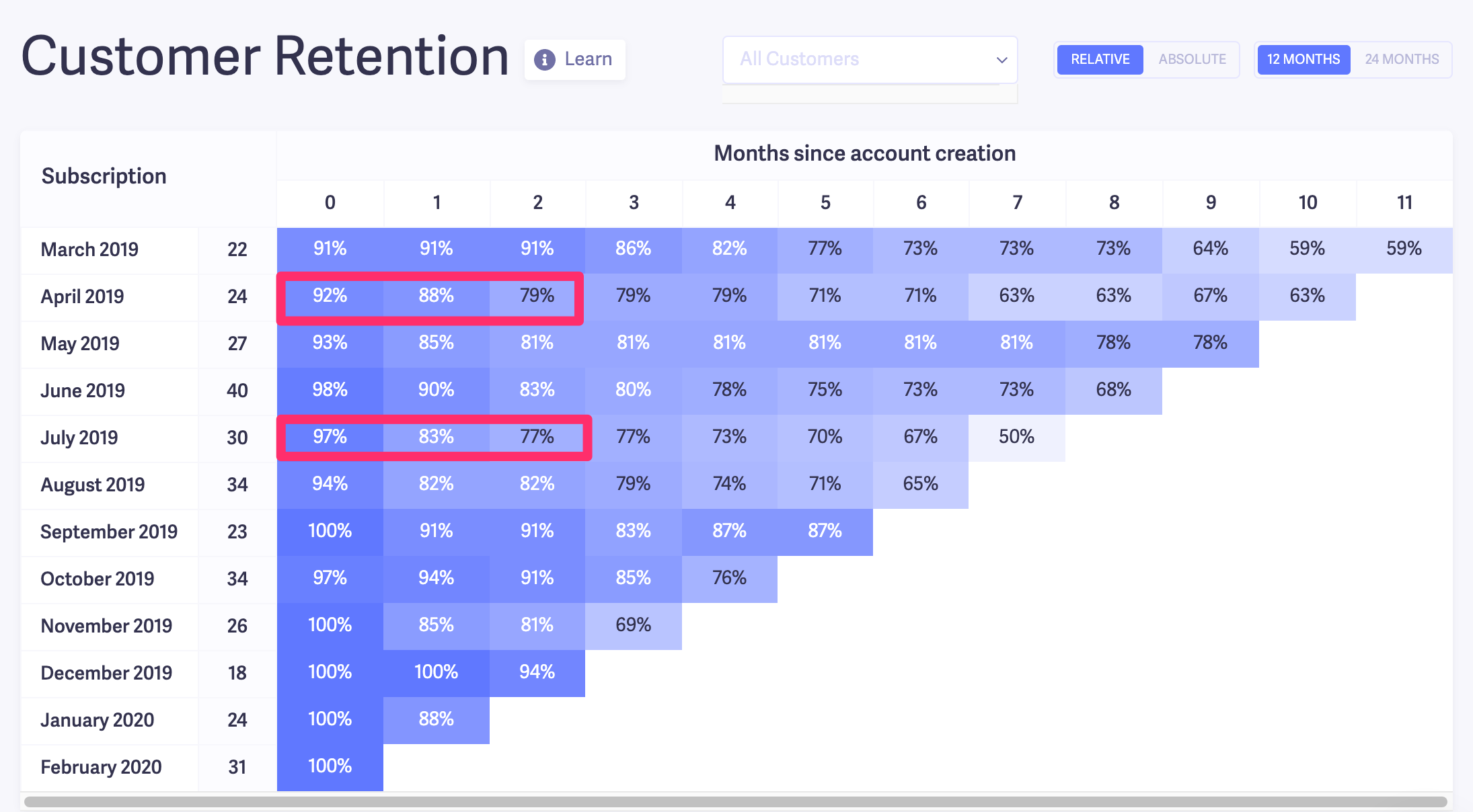
In Baremetrics, go to your User Churn dashboard. Then, scroll down to the customer retention table. This table shows your customers' retention rates month over month based on their signup date.
One way to use this data is to compare churn trends based on when people signed up.
For instance, looking at the table above, I noticed that the July 2019 and April 2019 cohorts have a much steeper dropoff after the first couple of months compared to the other cohorts. On the flip side, the March cohort had pretty solid numbers.
I'd be curious to dig a little deeper into this. So, my next step would be to compare customers who signed up in July and April to ones who joined in March.
To do that, I'll go to Customers in Baremetrics. Then add a couple of filters to only show customers that have signed up in July of 2019, with an LTV of greater than zero. The LTV filter is to make sure I'm only seeing data for paid customers.
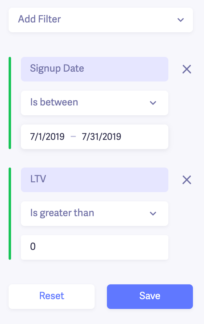
I did the same thing for the March and April cohorts as well.
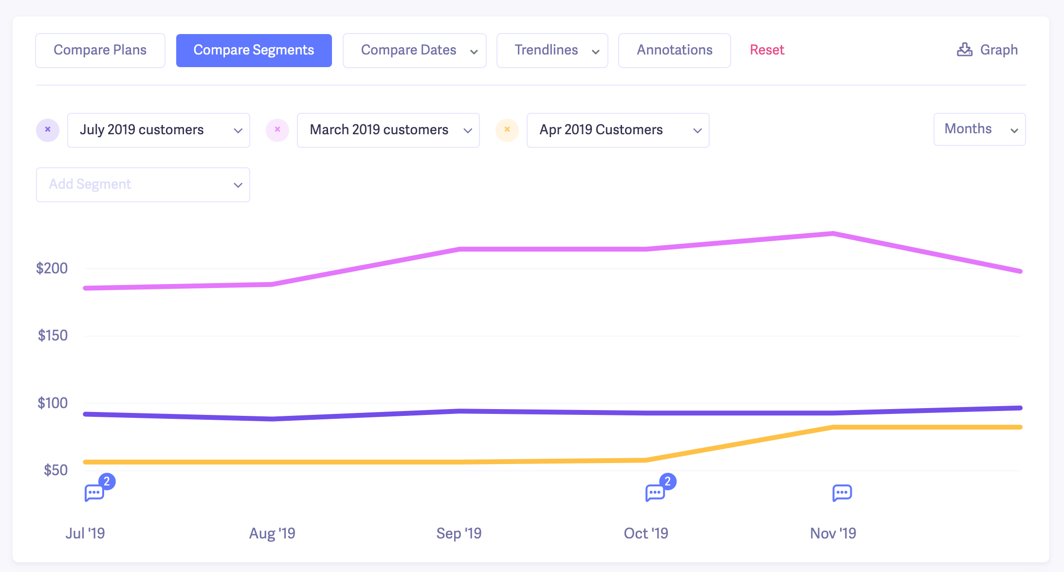
Now, I want to get more insight into the two cohorts to see if anything stands out. I'll start by comparing the average revenue per user (ARPU) of the two cohorts.
This will give me an idea of the value of the customers in each cohort.
Customers with a lower ARPU might be more entry-level and mainly interested in testing Baremetrics. That'd help explain why customers in the July and April cohorts dropped off sooner than the March ones.
Here's what I found from a six-month comparison.
The ARPU for our March cohort is more than double the July and April cohorts.
Based on this, one of my assumptions is that in March, there were probably some "bigger fish" who signed up for higher-priced plans or even had add-ons.
So I double-checked what plans the March cohort customers signed up with compared to April and July, and my assumption seems pretty accurate.
In April and July, quite a few customers signed up on lower-cost plans, which could explain why we didn't retain as many of them.
On the flipside, in March, we had more people sign up on higher-tier plans, and they retained longer than average.
The takeaway I got from this quick churn analysis is that we have a higher chance of retaining customers who:
- Use some of our add-ons like Cancellation Insights and Recover
- Sign up for or upgrade to our more advanced plans
Funny enough, this is spot on with what our head of growth (who's done much more research into this than I have) found. And it's one of the core philosophies of our Growth Manifesto, which he shared publicly.
Here's another way to use the cohort analysis data to analyze your churn.
Look at months 0-2 in the chart:
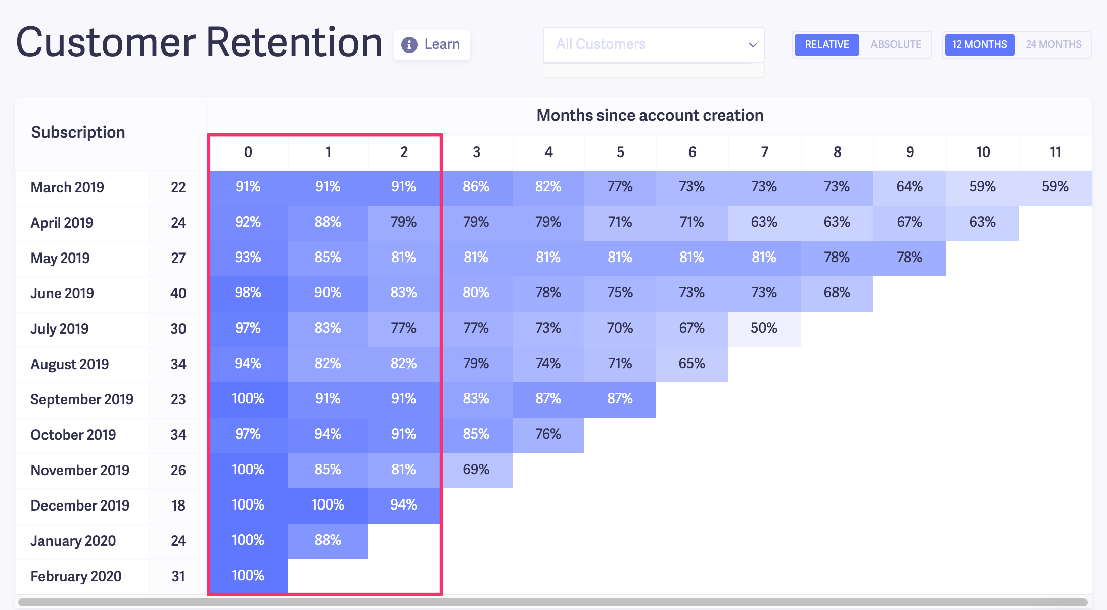
If you see steep drop-offs within the first 90 days, it's usually a sign of a problem. In most cases, it can come down to a combination of:
- Misaligned expectations between the customer and your product
- Poor onboarding
- A bad activation model (freemium, free trial, paid trial, money-back guarantee, consultation, etc)
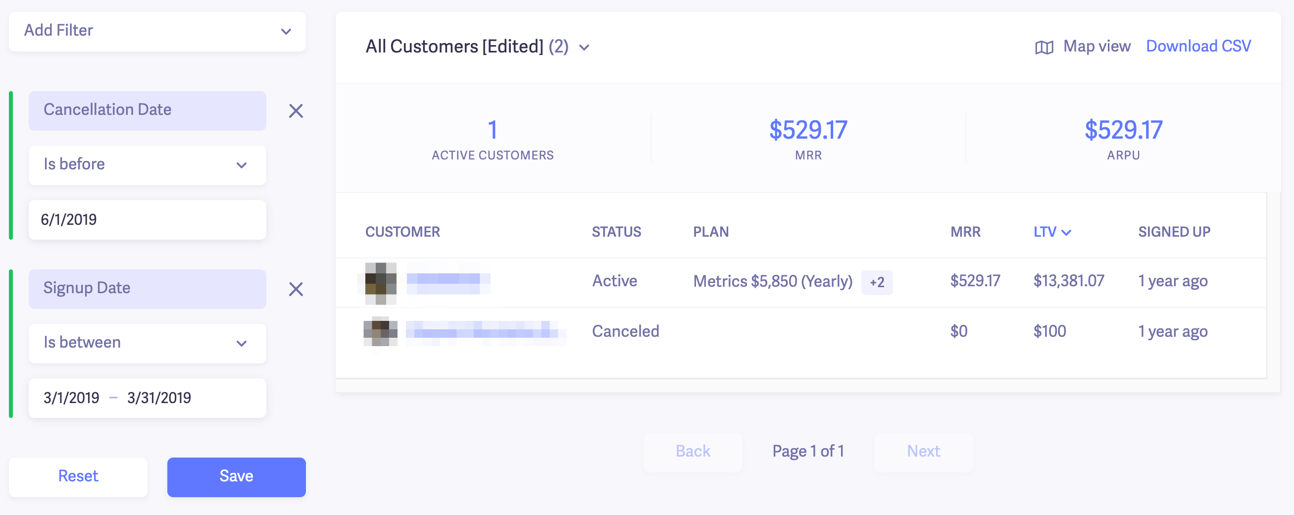
A good next step is to look at the accounts that were canceled within that 90-day period. To do that, you can head to Customers in Baremetrics and apply a couple of filters.
For our example, I applied a filter just to show customers who signed up in March, and another to single out the customers who cancelled after ~90 days.
Note: One canceled customer re-subscribed, so their status is "Active."
Then, you could go into each account and see its cancellation reason. In Baremetrics, you can see a timeline of the customer's activity from signing up to canceling.
Here's an example from one of those churned customers in the screenshot.
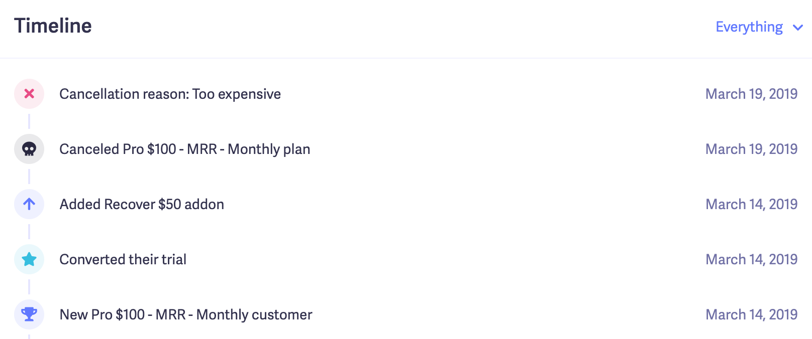
We can see that the customer signed up and canceled within days. Their cancellation reason was "too expensive." In this case, it could be a sign of misaligned expectations after they tried the product a bit.
We could send an email follow up to get more insights if needed.
If you have many customers churning within their first 90 days, it wouldn't be a bad idea to include exit interviews in your cancellations flow to find out exactly what's going wrong.
In addition to analyzing the first 90 days, you can use the cohort chart to find long-term retention trends. In the same way, we created segments for customers that churned within 90 days, and you could repeat the process for 6, 12, 18, and 24 months.
Those were just a few examples of how to do churn analysis. You can segment your churned customers and further analyze them in many ways. But if you stick with the framework we outlined, you'll be able to get most, if not all, of the insights you need to take the next step.
Reduce your customer churn rate with Baremetrics
Step one is complete. You know which customers are churning and why. The next question is: What do you do with everything you find?
Lucky for you, we wrote an entire article about it! I spent over a week talking to founders and marketers to get a peek into how they've managed to keep their churn under control.
If you're interested in learning more, I highly recommend reading it here: 6 Proven Strategies to Reduce Churn (With Real Examples).
Last updated: March 2026. This guide reflects current best practices for SaaS churn analysis and retention strategies.
Tired of wasting time on spreadsheets? Get a free trial of Baremetrics today!
FAQ
-
What is churn analysis and why does it matter for SaaS businesses?
Churn analysis is the process of examining customer cancellation data to understand why subscribers are leaving, which segments are most at risk, and what changes can improve retention. Knowing your churn rate is a starting point, but the rate alone tells you nothing actionable. A subscription business with a 10% monthly churn rate needs to understand whether those cancellations are coming from a specific pricing tier, a particular acquisition channel, or a cohort of users who never found product value. Without that context, any fix you attempt is a guess. Churn analysis turns a raw number into a diagnosis, giving founders and finance teams a clear basis for decisions that protect MRR and improve customer lifetime value. -
What is the difference between churn analysis and churn prediction?
Churn analysis looks backward to understand why customers already cancelled, while churn prediction looks forward to forecast which customers are likely to cancel next. In practice, churn analysis uses data like cancellation reasons, revenue segments, and cohort behavior to explain what went wrong and inform a retention strategy. Churn prediction uses behavioral signals, product engagement patterns, and historical usage data to flag at-risk accounts before they cancel. Both matter for subscription businesses, but they serve different purposes. Churn analysis tells you what to fix; churn prediction tells you who to save. Most early-stage SaaS companies should start with analysis before investing in predictive models. -
How do you calculate customer churn rate for a subscription business?
Customer churn rate is calculated by dividing the number of customers lost during a period by the number of customers at the start of that period, then multiplying by 100 to get a percentage. Start by pulling your total active subscribers at the beginning of the month, then subtract any customers who cancelled during that same window, and divide the difference by your opening count. That gives you your logo churn rate for the period. Keep in mind that customer churn rate and revenue churn rate are different metrics. A subscription business can lose a small number of customers but suffer significant MRR loss if those cancellations come from high-value accounts. Tracking both in parallel, which Baremetrics surfaces automatically alongside gross and net churn, gives a more complete picture of what cancellations are actually costing you. -
How do you identify why customers are churning without building custom reports?
The most direct way to identify why customers are cancelling is to ask them at the moment they cancel, using an in-app cancellation flow that captures structured reasons alongside an open-text field for additional context. This approach scales better than post-cancellation email surveys, which depend on customers choosing to respond after they have already left. Baremetrics Cancellation Insights does exactly this, presenting customers with a reason-selection form before their account closes and logging every response in a dashboard where you can see which cancellation reasons are driving the most MRR loss. From there, you can identify whether pricing, competitor switching, or low product engagement is the dominant pattern, and prioritise your retention efforts accordingly rather than making changes based on gut feel. -
What is the difference between gross churn and net revenue churn for SaaS companies?
Gross revenue churn measures the total MRR lost from cancellations and downgrades during a period, expressed as a percentage of starting MRR, with no offset for new revenue. Net revenue churn subtracts expansion revenue from existing customers, such as upgrades and add-ons, from that same loss figure. A subscription business can have a positive gross churn rate but a negative net revenue churn rate if expansion revenue from existing accounts outpaces cancellation losses. Negative net revenue churn is one of the strongest indicators of a healthy SaaS business because the existing customer base grows in revenue terms even when some subscribers cancel. Tracking both metrics separately is important because gross churn tells you the true scale of cancellation damage, while net churn tells you whether your expansion motion is covering it. -
When should a SaaS founder prioritise reducing churn over acquiring new customers?
A SaaS founder should prioritise reducing churn when the rate of subscriber loss is eroding the compounding value of new acquisition, which typically becomes visible when MRR growth stalls despite consistent new signups. If your monthly churn rate is above 5%, new customer revenue is often just replacing lost revenue rather than growing the business. At that point, investing in retention delivers a higher return than increasing ad spend or sales headcount, because every percentage point of churn reduction directly improves LTV and makes existing acquisition costs more efficient. Churn analysis helps you make this call with data rather than instinct, by showing you whether high cancellation rates are tied to a fixable product or pricing problem, or whether they signal a deeper mismatch between your offer and the customers you are attracting. -
What is involuntary churn and how can subscription businesses reduce it?
Involuntary churn happens when a customer's subscription lapses not because they chose to cancel, but because their payment failed, typically due to an expired card, insufficient funds, or a bank-side decline. It is one of the most recoverable forms of churn because the customer never actually decided to leave. Subscription businesses reduce involuntary churn by implementing automated dunning sequences that retry failed charges, notify customers of payment issues, and prompt them to update their billing details before the subscription is cancelled. Baremetrics includes dunning tools built specifically for this, so you can recover failed payments without manually tracking which accounts are at risk. For many SaaS businesses, fixing involuntary churn is the fastest way to reduce overall churn rate because it requires no product changes and targets customers who still intend to stay.


