Table of Contents
A well-designed website is more than just a collection of appealing pages that do a good enough job of representing your SaaS business. A great site is also the key element for reaching your target audience, securing leads, boosting conversions, and retaining existing customers.
In other words, a functional, attractive, user-friendly website plays a significant role in helping your SaaS business grow.
And even if you, personally, don’t really care much about aesthetics, there’s plenty of data proving that you should care about how your SaaS site’s homepage looks and performs.
- First and foremost, research has found that web visitors assess visual appeal within as little as 50ms of landing on a page, with their first impression impacting the likelihood of them converting.
- Secondly, a great browsing experience drives trust among potential clients, something worth giving your full attention to, considering we live in a world where almost 6 in 10 people say that distrust is their default stance.
- And, of course, let’s not forget that SaaS conversions are declining, with a 9% downturn between 2020 and 2021, which could be seen as a signal that SaaS web designers need to start working harder to attract and retain customers in an ever-growing market.
Fortunately, there are several improvements you can make to bring your website up to today’s standards so that it’s able to contribute to the growth of your business. So, if you’re ready to roll up your sleeves and make some changes, here are all the elements you need on a modern SaaS site’s homepage.
A customer-centric value proposition
If first impressions matter so much in driving trust and conversions, then it should be no surprise that the area of your website deserving most of your attention is the hero section of the homepage.
Data shows that the first screenful is where web visitors spend most of their time – 57% of their viewing time, to be more precise. By optimizing the elements in this area, you can effectively address the pain points of your potential customers and convince them that your products offer the exact solutions and benefits they need.
But here’s the catch: most SaaS homepages go straight into describing the software features they offer. And, sure, this can be a solid strategy when looking to differentiate themselves from the competition. Nonetheless, it can also result in the alienation of their target audience, who might feel disconnected from brands whose sole focus is on themselves.
Luckily, there’s an easy fix: creating a customer-centric value proposition.
By finding ways to describe your products from your audience’s point of view, you can:
-
Effectively grab web visitors’ interest (minimizing bounce rates).
-
Show potential customers what they stand to gain (and move them to the lower stages of the funnel).
-
Prove that your solutions deliver meaningful benefits, therefore boosting the likelihood of new leads signing up for a free trial.
For an excellent example of how a SaaS brand does this, check out the Aura homepage. As you can see, the value proposition gets straight to the point, inviting potential subscribers to “Maximize Amazon sales.” By leading with the benefit, the copy clarifies what the product offers. And although the features are mentioned just below the main heading, they are addressed in a way that, again, points out the rewards customers stand to gain by investing in Aura’s solution.

Source: goaura.com
Low-commitment CTAs
In addition to the unique value proposition you place in the hero section of your homepage, you’ll find that the main call to action also plays a significant part in securing conversions.
However, as you focus on optimizing your website for success, you should remember that most website visitors don’t convert on their first visit.
In fact, some resources suggest that it takes between six and eight touches before a prospect turns into a customer.
So, what can you do to stop first-time web visitors from navigating away from your pages without having captured them as leads? One option would be to create low-commitment CTAs that don’t invite people to sign up for a trial or become paid subscribers but rather aid you in moving people down the sales funnel.
For a great example of how you can do this, check out the Quetext homepage. Instead of inviting people to immediately sign up for the free (or paid) versions of its software solution, this SaaS brand understands the importance of having prospects evaluate its core product.
So, it employs a CTA that encourages them to do just that – no fees, no commitments, and most importantly, no risks involved.

Source: quetext.com
Alternatively, if you don’t offer product previews, you could do what Mighty Networks does and encourage first-time visitors to watch a demo. This is another excellent strategy for introducing software benefits and features without forcing prospects to take on a risk they’re not yet ready for.

Source: mightynetworks.com
An explainer video
If you want to build a modern SaaS homepage, you have to be prepared to use video. And that’s not just because video content is growing in popularity but also because research shows it’s one of the absolute best ways to introduce your products.
According to Wyzowl’s latest survey reports, as many as 73% of customers prefer to watch short videos to learn about a product or service. Add to this the fact that 78% of people say they’ve been convinced to subscribe to a SaaS product by watching a video, and it becomes clear that explainers should definitely be a prominent feature of your homepage.
There are a few rules you should aim to follow if you want your investment to pay off when utilizing explainer videos for SaaS growth.
1. Make sure the explainer is just the right length
A case study from Breadnbeyond found that the ideal run time for explainers was between 60 and 120 seconds, with viewers’ attention rates sharply dropping after the 2-minute mark.
So, if you’re planning to add this type of media to your website, ensure that you’re keeping it short, simple, and approachable. Yes, there is always a lot to say when you’re introducing the features of a complex software product. But chances are, your audience is only prepared to give you a small amount of their time, so get to the point and leave the details for your site’s features section.
For an excellent example of a SaaS brand making full use of a 120-second explainer video, check out the one on the Optimal Workshop website. It’s a super-time-efficient description of a complex product.
And one could even say that the video helps the brand create a market for its products, seeing that many of Optimal Workshop’s target audience still don’t know the positive impact user research could have on their business results.

Source: optimalworkshop.com
2. Nail the tone and visuals
To see tangible benefits from adding an explainer video to your homepage, it has to be a proper reflection of your brand. This means that both the visuals and the voice you use have to communicate your brand’s mission, vision, and values, and they have to appeal to your target audience.
For example, BambooHR is a SaaS business building its reputation as an approachable HR solution that knows the ups and downs of dealing with employee management. This is why its explainer video starts off by offering an unfiltered peek into HR, showing the exact situations the program aims to solve and proving that the brand truly understands its audience and their unique pain points.

Source: bamboohr.com
3. Pay attention to placement & UX
Finally, for an explainer video to effectively convert website visitors, it must be well-positioned on your homepage.
Ideally, give it a spot above the scroll-line, as this is where visitors will spend most of their browsing time anyway. Moreover, don’t make it cumbersome for web visitors to play the video. Ensure that the user experience is exceptional – something you can achieve by hosting your explainer on Wistia.
Lastly, to guarantee that your explainer videos actually deliver results, don’t forget to end them with a call to action, as done by Officevibe below.

Source: officevibe.com
Visuals of your product in action
The next element of a modern SaaS homepage is visual content.
Essentially, today’s buyers aren’t that big on reading. Research shows that most users skim text online instead of reading it. And eye-tracking data from MOZ proves that images outperform text, even when they’re not positioned in primary spots on these pages.
With this in mind, your SaaS homepage needs to utilize visuals to elevate the user experience and effectively present your products.
Screenshots, for example, are a great way to illustrate features, give insights into what your software can do, and manage potential subscribers’ expectations regarding what they can expect. You can also use them to help people determine whether your product is capable of solving their pain points and whether it possesses the functionalities they require.
Notion does an exceptional job of using visuals to offer sneak peeks into its service, seeing that it doesn’t just add screenshots to its site but elevates them to GIFs. By taking this course of action, the brand effectively shows what the product looks like and illustrates several use cases that would otherwise require entire blocks of text to describe.

Source: notion.so
Exceptional social proof
Another superb strategy for convincing website visitors to consider investing in your product is adding social proof to your homepage.
Showcasing ratings, reviews, testimonials, and user stories is an excellent way to persuade potential customers to subscribe to your service. Especially seeing that 88% of people rank word-of-mouth advertising as the most-trustworthy format and that 50% more people trust recommendations than paid ads.
However, the best type of social proof for your homepage entirely depends on your target audience.
For example, if you’re trying to convert risk-averse buyers (like businesses), you will want to go with high-quality social proof. Even if it means sacrificing quantity.
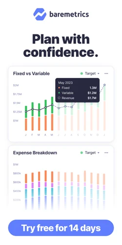
For inspiration, check out the Baremetrics Customers page. As you can see, it describes the challenges users managed to solve by implementing our solution and offers ideas for those looking to get more out of their investment.

Source: baremetrics.com
Alternatively, if you’re a B2C business looking to take social proof to the next level, you could check out Bay Alarm Medical. This brand chose to utilize a floating Google Rating widget in the lower-left corner of its homepage. But, what stands out in this example is that the rating widget is always visible – no matter how far down web visitors scroll.
Bay Alarm Medical also includes additional testimonials on its homepage – the NBC Today video stands out in particular. What makes the whole thing effective at getting buyers to convert is that every single iteration of social proof on the brand’s website is chosen to appeal to its target audience – the elderly and their caretakers, who want extra security for their loved ones.

Source: bayalarmmedical.com
Contact options
Whatever your goal – capturing more leads, boosting retention, improving customer lifetime value, or simply enhancing the customer experience – your homepage must offer convenient ways for web visitors to get in touch with you.
Research from SuperOffice shows that only very few people believe they’re on the receiving end of exceptional service. And according to the same survey, for brands to offer exceptional customer experience, they must deliver fast response times, consistency across channels, knowledgeable staff, multiple contact points, and easy-to-use tools for service.
The best part about this data? It shows how many of these requirements can be solved by adding more contact options to your site.
Yes, expanding your contact points will mean spending some money hiring more employees or developing AI-driven chatbot solutions that can aid your potential customers. But, it will also mean boosting your brand’s credibility and helping customers see it as a reliable solution to their needs.
There are several beautiful and user-oriented ways to do this.
For example, you might draw inspiration from ServiceNow and add a floating Contact card web visitors can use to get in touch via email.

Source: servicenow.com
You might go the traditional route and reserve your footer for multiple contact options.
Or, you might choose a solution such as Intercom and create a customer communication solution that helps your business convert new customers, engage web visitors, and support existing users to drive next-level results.
Accessible, meaningful product descriptions
While sometimes, the key to growing your brand with the aid of homepage features includes adding new elements, other times, the solution is to take some things away.
The latter can be especially true with product descriptions.
On modern SaaS websites, your copywriting should always aim for simplicity. And there are several reasons an accessibility-first approach works:
-
We’ve already mentioned that web users don’t read online text. Instead, they skim in one of several common reading patterns, which means that the best way to communicate high-value information is through attention-grabbing headers, visuals, and bullet points.
-
The higher the readability of a page, the greater its chances of securing a conversion. In fact, for its 2022 Conversion Benchmark Report, Unbounce measured how readability and word count impacted conversion rates on SaaS and concluded that shorter and more understandable product descriptions simply performed better than their counterparts.
-
Finally, don’t forget that the key to capturing your target audience’s attention is to write in a voice and tone appealing to them. So, if your SaaS product is targeted at casual users, don’t blow your chances of selling it by trying to sound impressive with sophisticated jargon or in-depth technical details.
The great thing is that there are multiple proven-to-work tricks to ensure your homepage copy is engaging and convincing.
For example, if you take a quick look at the Ultimate Meal Plans homepage, you’ll see that the brand employs a simplified communication method for explaining what its product does. By breaking the entire process into three stages, using illustrations, and limiting each copy section to just a couple of sentences, Ultimate Meal Plans effectively describes its service while keeping its audience highly engaged and preventing them from becoming overwhelmed.

Source: ultimatemealplans.com
If you operate in a niche where your audience is likely to be a bit more technically savvy, you can allow yourself to go into additional detail.
Skubana is an ecommerce inventory and order management platform for multichannel ecommerce. In other words, it’s a B2B organization that knows its potential clients are already experienced in online sales.
With this in mind, Skubana’s homepage copy doesn’t shy away from using niche terms and industry-specific phrases. On the contrary, it employs abbreviations, addresses KPIs, and gets straight to the point. And it even goes so far to avoid wasting web visitors’ time that it addresses the possibility of its potential clients being bored of reading SaaS pitches, inviting them to book a demo instead.

Source: skubana.com
A window to your prestige content
Lastly, as you explore ways to bring your SaaS site’s homepage up to today’s standards, don’t forget that one of the best ways to show your authority on relevant topics is to employ a well-planned content marketing strategy.
And, to secure the highest possible ROI from the content you publish, it’s not a bad idea to feature your prestige blog posts on your homepage.
The absolute best thing about this course of action is that linking to your blog posts from your homepage is super simple. At the same time, it shows leads that you understand their pain points, that you’re willing to take the time to answer their questions, and that your brand cares about them getting value out of their subscription.
For an excellent example of a SaaS business that employs this tactic to boost brand image and nudge web visitors down the sales funnel, check out Miro. As you can see, this brand’s homepage features a Remote work resources section where visitors can read guides, FAQs, and even access webinars.

Source: miro.com
Alternatively, you may experiment with automated content features, as seen on the Attentive homepage. But, remember, this approach might not always work as the content linked may not include your most valuable published pieces.

Source: attentivemobile.com
Is your SaaS homepage growth-ready?
There you have it, the anatomy of a modern SaaS site’s homepage.
As you can see, the elements you need to include on the primary page of your website aren’t that complicated.
Everything you need to do to optimize for growth is to understand your audience’s pain points, eliminate risk, use different content types and formats to prove your brand’s trustworthiness and authority, and commit to being there for your customers when they need you.
Of course, to ensure the best outcomes, you will have to measure and analyze your website’s performance and how it impacts your business metrics like MRR, LTV, ARPU, and more. So don’t forget to start your free trial of Baremetrics to gain the insights you need in order to take your business to the next level.